Friday, July 26, 2019

Research: Painting - Interview with Richard Hatfield, artist

Research: Painting - Interview with Richard Hatfield, artist

Studio 7, The Ropewalk, Barton upon Humber
Introduction
Last year I went to an exhibition of works by Richard Hatfield and Tim Needham at the Ropewalk, Barton upon Humber. I was interested in Richard's use of texture and his colour palette in his landscape paintings.

Richard Hatfield, Two small paintings  Jetty (left) and Riverbed (right)
 

Ropewalk Exhibition October 20 to November 25th, 2018

 Richard Hatfield
Personal Details
BORN: Boston, Lincolnshire, 1960
STUDIED: Grimsby School of Art, West Surrey College of Art & Design (Farnham)
EXHIBITIONS : Include, Royal Festival Hall,  London Institute, Affordable Art Fair, Battersea, Patriot Hall Gallery, Edinburgh,  Ferens Art Gallery, Hull, North Lincolnshire Museum and Art Gallery, Zillah Bell Contemporary Art, Thirsk, Usher Art Gallery, Lincoln,  and others across the country.

Background Information
Extract from Richard’s Website:

“The colours, scale and nature of the landscape provide a constant source for my image making. The paintings are the amalgamation of the remembered, the fleetingly observed and the emblematic motifs imprinted on the retina.

The paintings (using oil and acrylic) are constructed using layer upon layer of thin colour that produce an intensity of pigment or create ambiguous veils of paint that vaguely describe the subject. Often painted over a coarse textured ground, layers of paint are added and subsequently removed generating a rich patination of surface".

“He works paint into multi-layered and complex surfaces, where, through repeated attention, seeks to reveal a critical moment of harmony. This approach finds dramatic effect even in the smallest of works, where, through mixing colour directly onto the painting, hues and tones emerge, appearing to have almost seeped out of the environment and into the surface of the painting.”
(Gill Hobson, artist and writer).

 Richard’s Practice Statement:

“My paintings are a reinterpretation of the landscape I see every day, reflecting its scale and the colours of the changing seasons. I am concerned with our growing alienation from nature and its disconnection from our daily lives.” (Quote from Open Studios website)
Interview
In my Interview with Richard I asked him about his approach and techniques to painting. I had seen a recent exhibition of Richard’s work and already knew that he specialises in atmospheric landscapes, with an emphasis on texture and colour to give the “feel’ of a place. I asked Richard the techniques he uses when creating his landscape paintings.

Richard creates texture by painting over his old paintings, this gives a “ready-made” texture to begin with. He puts a primer on first, and it does not matter what direction it goes in. Then he textures the primer. He makes an acrylic gesso mixed with whiting or acrylic binder. He just slaps it on. Then he dry brushes it afterwards for effect as the acrylic is slightly drying. Some bits come off, and some are smoother. He mixes his pigment (acrylic) with binder or water and works in thin layers or thicker ones. Richard works intuitively and has got into his own method of working. He goes through this process and something comes out the other end. He does not usually have a pre-conceived idea or picture in his head. He may have a thought of a bit of light in a field and start a painting based on that. His paintings are not representational, but are parallel to or equivalent of the subject matter – feeling is more important.

Some examples of Richard’s paintings and his way of working are shown below. Both works showcase Richard’s techniques, use of texture and subtle use of colour using a reduced palette.
 
 
Richard Hatfield, Fading Light
 
Richard Hatfield, New River
Conclusions and summary
I think that the idea of using old canvasses and painting over them is an excellent idea. Not only does it provide ready-made texture, but is also environmentally friendly by recycling.
Also, I could adopt some of Richard's other methods to add texture, such as adding material to gesso, primer or paint. I have done some of this before , but I have not used whiting or binder for this purpose. His way of working in thin layers could also work for me.
I think that Richard's colour choice is good in that he works within a small range of hues which suit his subject matter. Although Richard's work is non-representational, I can pick up on some of his techniques to highlight areas of the canvas to emphasise a focal point - as he does in new River (above) where bright green/blue provides the focal interest.
I was interested in the fact that Richard's thinking behind his practice has much in common with my own, summed up as follows:
"I am concerned with our growing alienation from nature and its disconnection from our daily lives."
(Richard Hatfield)


Thursday, July 25, 2019

Research: Curation - Interview with Richard Hatfield


Interview with: RICHARD HATFIELD,

Director and Exhibitions Officer, The Ropewalk, Barton upon Humber
Background
Richard Hatfield is a Director at the Ropewalk, Barton upon Humber, a regionally acclaimed centre for the arts housing four gallery spaces, artists studios, a printing room and other facilities. It is supported by the Arts Council England. 
Richard is also a highly acclaimed artist in his own right, specialising in landscape paintings. I interviewed Richard separately in relation to his painting practice, which will be the subject of another  post.
Curation

I started the conversation by asking Richard about his approach to curation. We took the current North Lincolnshire Print Open Exhibition as an example, and walked around the galleries. I began by asking whether he looked for themes, grouped relevant artists or what was his aim for the show?
Richard said that his approach to the Open Exhibition was different to dealing directly with an individual artist.
For the Open Exhibition his aim was to see the show as one big exhibition. As regards the hanging of the works he would blend in sizes, colours and types of work.
He pointed out that some curators go for contrasts, putting works next to each other which may appear quite random e.g. a Rembrandt next to a Picasso, without apparent context or visual connection. Richard’s aim is to visually connect the works for the viewer, but so that as they walk around they may not necessarily be aware of those connections.
There are two galleries at the Ropewalk, but Richard dealt with both rooms in the same way, so that in effect, there were two groups of works and two exhibitions. He aimed for a mix of works in each.


A “mix” of work, “which visually connect”, The Ropewalk, North Lincolnshire Print Open Exhibition
A key factor was that as the current exhibition comprised of prints, there was a predominance of monochromatic works. This raised the issue of blending in the colours. This would not necessarily mean placing such works together, but to aim for a balance.
From a practical point of view, Richard would generally deal with the more “difficult” works first so that they do not jar visually. He took as an example some highly original works by Andy Dakin who had incorporated print into 3D objects. To facilitate these works Richard had introduced a separate plinth for them (see below).


Andy Dakin, Artefacts with indeterminable functions, Offset Lino Print on found object

Richard would then spread the works around and then start to divide them, looking for any “problematic” works which he did not want to jump out. He would also try to hang an individual artist’s work next to each other. He would move coloured works together, but pick out the bright and strong as he would not want to put those next to something “quiet”. All the time Richard would be looking for little connections, such as something which feels similar e.g. a linear dimension, such as the two works below – ferns and the contours of a map.

Stef Mitchell, Rhododendron looking over to Arran, nature monoprint

Susan Wright, New Topology 2, Etching
Richard considers how the works look visually, the deciding factor could even be the frames (e.g. black/white), something else like texture,  or the subject matter. He gave other illustrations such as the Artist’s Book, Water, by Jan Stead. He had decided to place it separately because of its individuality, rather than with her other works (see below).
 
Jan Stead, Water, Artist’s Book
 
Looking at one of the main walls in the Art Space gallery, Richard had decided to “book end” four large, monochromatic individual screen prints by artist Lee Sass. In between he had placed other monochromatic works with the same “feel”, such as woodcuts” and others with muted monochrome colour schemes, such as blue. On other, smaller, walls he had grouped works and would use starts, corners and plinths as punctuations. Richard often starts with the big pieces and then links them with the others.

Picture Hanging
As a general rule, Richard hangs works at “eyeline” i.e. the centre of each work will be 5 feet from the floor. This way it is the best and easiest to look at a picture. As regards a double hanging, he creates a regular gap between the pictures and then treats the works as one picture i.e. he adds up the dimension of the gap with the depth of each picture and divides by two, this gives the centre line for hanging purposes. He always puts  a smaller picture beneath a larger one, as he thinks that it is easier to look down rather than up.
Exhibitions by Individual Artists

Richard says that his approach to setting up an exhibition for the works of an individual artist is more concerned with the overall concept and theme of the artist’s practice. Some artists come with a pre-conceived approach. For example, Sinclair Ashman is a graphic designer, so he had a defined view of how he would like his exhibition at the Ropewalk to look. Sinclair had designed the layout himself beforehand and produced his own video of himself working which was shown throughout the show. Richard said that this approach was unusual, which gives him scope as the curator to exhibit the works to their maximum advantage.

Summary and Conclusions
I learned a lot about curation from my interview with Richard, which I can use in my own practice. From a practical point of view, his methodology for hanging pictures and his "5 foot rule" will be very useful to get the viewing height correct. I can also build on his insights into grouping works with subtle connections and use them in connection with setting up exhibitions of my own work. The ideas about getting a good "mix" and blending in the colours will also be useful, as will the fact that it is a good idea to deal with more individual or "difficult" works first. It was interesting to learn how to display works and invoke the attention of the viewer in subtle ways, so that they are not necessarily aware of the time and effort which has gone into the thinking behind setting up and hanging an exhibition or show.

Tuesday, July 23, 2019

Research: Visit to Hull Fishing Heritage Art Exhibition

Research: Visit to Hull Fishing Heritage Art Exhibition
 
Introduction

 
Interior of the church with exhibition banners and video

This was a visit which was a little bit different to the usual type of art exhibition. It is a free exhibition dedicated to Hull's rich fishing heritage held at St John the Baptist (The Fisherman's Church), St George's Road, Hull. The church was at the heart of Hull's fishing community, being the local church for weddings, baptisms and funerals. The nearby Hessle Road was where many of the trawler men and their families lived. It was a bustling, thriving community with its own unique identity. The exhibition celebrated that tradition.

 
Banner, with trawlermen in their typical best outfits

 Overview

The Church was set out with large banners depicting scenes and people from Hull's fishing heyday, and near the altar there was a large video screen with a series of contemporary films of life at sea and home comings. It also featured photographs and  tributes to the many lost at sea, either in fishing disasters or swept overboard in heavy seas. It was very moving and I could not help but notice some of the ages of those lost - one being an assistant cook, just 15 years of age. There were also displays of fishing memorabilia interspersed between the art exhibits.

 
Fishing memorabilia

The Art Works

The works included paintings, prints and sculptures. They were all connected with the theme of Hull's fishing heritage. Displays were centred around the names of the streets off Hessle Road where the fishing community lived.

Models and images of trawlermen  were set alongside paintings of fishing vessels, prints of working practices and sculptures of a wide variety. The works had mainly been done by local people. I had entered the exhibition and had a piece accepted. I set out below photographs of some of the wide range of works exhibited. My work was a screen print, "Rope", in the Rugby Street section which illustrated working practices - see below.


Folk Lore
 
Lillian Bilocca "Big Lil"
 
"Big Lil" was a fisheries worker who campaigned for improved safety in the fishing fleet as the leader of the "headscarf revolutionaries" spurred into action by Hull's triple trawler tragedy of 1968 which claimed 58 lives.


Screen prints
 
 
Glen Dickson


Jean Edwards
 
I was particularly interested in some screen prints. The first, by Glen Dickson, was of three trawlers with a multi-coloured and dynamic background. The second was a set of three screen prints, by Jean Edwards. These prints were an excellent example of the good use of restrained colour and the combination of techniques. The effect was one of intrigue and mystery and a feeling of time passing by. 
 
Summary and Conclusion
 
It was a good idea to enter my work into the exhibition as it gave me the opportunity to show my work in a completely different kind of venue and setting. The whole exhibition was held together by its central theme of Hull's fishing heritage, which was the key to the success of the event.
 
I will follow up my research into the techniques and colour palette of  the screen prints above, as I think that I can learn from them. 


Monday, July 22, 2019

Research: Visit to the University Art Collection, University of Hull

Research: Visit to the University Art Collection, University of Hull
 
Overview

The University Art Collection at the University of Hull, is a relatively small, but focussed collection devoted to British Art between 1890 and 1940.

The collection includes works by some of the "big names" of this period.

It is well thought out and presented.


First Gallery, with Frank Dobson's Cornucopia, 1925-27, in the foreground
 
History

The collection was only inaugurated in 1963 and had limited resources. This meant that the university concentrated on the less fashionable schools of the time. Malcolm Easton, founder curator, wrote in 1965:

"We believe that the choice, in terms both artistic and educational, has spendidly justified itself.....The country cannot fail to be impressed by the quality of our acquisitions and the enlightened generosity of our patrons..."

(Leaflet, University Art Collection, Art in Britain 1890-1940, University of Hull)

The collection supports the studies of university students in the history of art, research and art appreciation, and that of the wider community as it is open to members of the public.

The Collection

The Collection is housed in a new gallery, which forms part of the Brynmor Jones Library. It is well laid out with good lighting. The University provides a helpful leaflet which sets out a floor plan as to the layout of the exhibits and key artists (see below).


Floor Plan
Except for loans and rotations, the exhibits are fairly static, but there is another gallery next door for temporary exhibitions.

The first impression if of a light and airy environment. The works follow a datal sequence, with some specialist areas, such as for portraiture and draughtsmanship. There is an area set aside for temporary displays and scattered throughout the galleries are sculptures by eminent artists of the period.

I have selected below some examples of the works on display from photographs I took on my visit. I have concentrated on landscapes and, in particular, my theme of how human activity relates to and interacts with the natural landscape.

 
Walter Richard Sickert, L'Eglise du Pollet, Dieppe, c. 1900
 
Sickert was perhaps the leading British Impressionist. He was a pupil of Whistler and influenced by Degas. In 1911 he co-founded the Camden Town Group.
 
 
Roger Fry, Farm Buildings, France, c. 1913
 
Fry was both a painter and an influential art critic. He was Director of the Metropolitan Museum, New York and editor of the Burlington magazine. He was deeply impressed by Cezanne and organised the two Post-Impressionist Exhibitions in London, becoming the leading champion of modern French art in Britain.
 
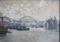
Stephen Bone, Swing Bridge, High Level Bridge and King Edward VII Railway Bridge, Newcastle upon Tyne, late 1920s
 
 
Clifford Hall, A Street in Malakoff, 1928
 
 
Charles Cundall, The Wear Bridge c. 1930
 
 
John Piper, Great Goxhill, Lincolnshire, 1947
 
This work is a good example of Piper's atmospheric style and art of the "New Romanticism" of the mid-1930s
 
 
Charles Ginner, Wear Cliffs, Dorset, 1922
 
 
Augustus Lunn, Lowestoft, 1938, watercolour
 
 
James Dickson Innes, Sunset in the Pyrenees, c. 1912-13
 
Colour
 
 
Lucien Pissarro, Blossom, Sun and Mist: Chipperfield, 1914
 
Lucien was the eldest son of the French Impressionist painter, Camille Pissarro. he studied under his father and was influenced by Seurat. Note the muted colour palette.
 
 
Samuel John Peploe, Interior with Japanese Fan, c. 1915
 
Peploe studied in Edinburgh and Paris. He was one of a group of Fauve-influenced Scottish artists now known as the "Scottish Colourists". The bright, contrasting colours are typical of this group of painters.
 
Curation
 
 
Above: Example of the curation of the collection: Sir Stanley Spencer's Villagers and Saints of 1933 on the rear wall and Henry Moore's Family Group, 1945 to the left.
 
I was fortunate in being able to meet  John Bernasconi, Director of the University Art Collection, who lectures in art history. He specialises in Italian Renaissance art and art in Britain, 1890-1940. He organises an annual programme of exhibitions and public lectures for the university. Bernasconi emphasised the importance of specific artists and movements of the period included in the university's collection. He explained the layout of the galleries and the thinking behind the scheme. The paintings are hung mainly in chronological order, but with areas covering particular schools or key themes. Big names such as Epstein, Bomberg, Vanessa Bell, and Augustus John feature, and each exhibit is accompanied by a short resume of the artist's background, career, influences and importance. To illustrate the importance of curation, he told me how he gave an important, highly original work by Sir Stanley Spencer prominence, by hanging it in the middle of the wall at the end of  the run of galleries to each side. The university is lucky to have such works  included in its collection.
 
Summary and conclusions
 
The visit was informative from the point of view of seeing further examples of high quality landscapes from prominent British artists. There were a number of industrial scenes. The period covered was limited and the styles reflected the era. This was not a disadvantage and it gave me much food for thought. Some of the industrial scenes were very impressive and displayed a reduced palette dominated by  greys which I was interested in. Pissarro's cool colours, mainly greens, also suited his subject matter. In contrast, the work by the Scottish Colourist, Peploe, demonstrated how to use bright, contrasting colours favoured by the Post-Impressionist Fauves, or "Wild Beasts". Overall, I gained a lot of knowledge about the period from my visit and some thought provoking ideas about  curation from John Bernasconi.


Monday, July 15, 2019

Research: Galleries and Exhibitions - North Linconlshire Print Open Exhibition

Research: Galleries and Exhibitions - North Lincolnshire Print Open Exhibition, 2019
 

Background

I am currently researching a cross section of Galleries and Exhibitions to guide me in progressing my professional practice as a visual artist.

I think that it is important that as well as looking at traditional art galleries and exhibitions I should also consider some local exhibitions and gallery space. It is more likely that these venues will be suitable outlets for my work.

The North Lincolnshire Print Open Exhibition, 2019

 
I recently entered some of my prints into the North Lincolnshire Print Open Exhibition at the Ropewalk, Barton upon Humber. Three of my prints were chosen by the selectors, Melvyn Pettersen and Rob Moore.

I have previously been to workshops organised by Melvyn Pettersen who is a well-known and highly regarded painter/printmaker.

I went to the opening of the exhibition and was interested to not only see my own prints, but all the other work on display. I think that I can learn a lot from the other artists whose prints feature in the exhibition.

I took a number of photographs to make a record of works which I think may be important to me from a conceptual or technical point of view. They act as a reminder of what I saw and as a prompt for further investigation.

In addition, my purpose was to research the curation of different types of exhibitions and how curators can approach their topic. This may vary from the way a gallery is set out, to the concept behind the approach. My purpose is to gain insight into how I may improve the curation of my own work, such as the Exhibition I gave in the HSAD building of my work at the end of Module 2 - Research and Development.

Art Space

My prints were on display in the Art Space, which is the larger of the two galleries. Two of my prints, which used the drypoint technique, had ropes and driftwood as their subject matter and were hung next to each other. The ropes were a particularly relevant topic as the venue of the Ropewalk building was historically used for making ropes and the place combines a small museum of its ropemaking heritage.

The  prints were included in a span of other monochrome works, which the curators had picked out as complementary. Some of the other prints alongside my own were lino cuts and screen prints. They were displayed in a minimalist style where they were shown to maximum effect in a single row on a plain white background. There was no over crowding or mixing of styles or colour, which was very effective.


My prints, Art Space, the Ropewalk


My prints alongside other monochrome works.
 
The other print which was selected was a view of Horkstow Bridge. This is a new work, and I had only just completed it prior to the date of submission for the exhibition. Again, it is monotone, but I used a different technique. I took a piece of aluminium and applied  a "soft ground" onto the plate into which I drew the composition. It was then etched in copper sulphate and then an aquatint was applied to give tonal areas.


My print of Horkstow Bridge  (Upper print)
 
 
My print as exhibited in context
 
This work was included in a run of prints of landscapes and other topics, some of which were in colour. Mine was placed above another landscape which complemented my theme. Some of the prints on this wall of the gallery were in bright colours, which gave variety. I was interested in the use of colour and in the techniques used in making them.
 
 Use of Colour
 
I have selected a range of photographs of exhibits from the Ropewalk's Art Space and Gallery One. I have included those which I think I can learn from. I include a brief summary of the technique used so that I can further my research into those methods by contacting relevant artists. Some of the photographs unfortunately include glare from the overhead lights.
 
Art Space
 
 
Lucy M. Hainsworth, Bridging the Kyle, Silk Screen (Winner)
 
 
Sally Beaumont, Japanese Piebald, Photo Litho, (Runner Up)
 
 
Katherine Rhodes, The Pinnacle at Froggatt Edge, Linocut (Runner Up)
 
 
Penny Kealey, Frieze at Burton Constable, Woodcut (rearranged)
 
 
Susan Wright, New Topology 2, Etching
 
 
Louise Mcniff, Moor, Early Spring, Screenprint/Monoprint
 
 
Lucy M. Hainsworth, Valentine's Fair, Silk Screen
 
 
Sally Beaumont, Basrah Horse and Cattle Show, Photo Litho with hand colouring
 
 
Stef Mitchell, Rhododendron looking over to Arran, Nature Monotype
 
 
Clarissa Dixon, Double Yellow, Concertina, Red Paving, Road Surface, Collagraph
 
Gallery One
 
 
Jemima Davis, Untitled 1, Etching, drypoint and chine colle
 
 
Sue Allison, Butterfly Wing, Reduction Linocut
 
 
Ian Mitchell. Northern Breakwater, Vector Drawn Digital Print
 
 
Katherine Holland, Egyptian Dance, Drypoint/Monotype
 
 
Lindy Norton, The Visitor I, Drypoint, Etching and Watercolour
 
 
Lindy Norton, The Visitor II, Drypoint, Etching and Watercolour
 
 
June Barker, Hedgerow I, Collagraph
 
 
Jan Stead, Water, Artist's Book
 
Summary
 
I have identified the following categories of ways to incorporate colour into my prints which
I can research further:
 
- Silkscreen (plain or multi-coloured backgrounds, or painted onto screen "monoprint" style)
- Layering techniques (e.g. coloured backgrounds for drypoint, or combining coloured collagraph with overprint of dry point)
- Single colours (e.g. blue)
- Applying printing ink A la poupee (by hand selecting areas to be individually coloured before rolling through the press)
- Hand colouring (watercolour, pastel etc. over different types of prints)
- Nature monotypes in colour, either as individual prints or as backgrounds for others
- Chine colle (use of coloured tissue paper placed on top of print and coated with glue before going through the press)
- Drypoint combined with monotype
- Artist's Books combined with any of the above
 
I also think that some of the prints are informative from a painting point of view and the option of using a restrained colour palette e.g. works by Ian Mitchell, such as Northern Breakwater (above).
 
Curation
 
The exhibition was informative in the way that it clearly showed effective hanging choices e.g. minimalist approach, monochromes, coloured and sympathetic subject matter placed together.