Sunday, December 22, 2019

New Works: Portfolio - Painting (1)

New Works: Portfolio - Painting (1)

Introduction
Building on my research into artists such as Charles Sheeler and Graham Sutherland, my practical work has recently explored the concept of scale.

First, I considered the proposition that scale can affect the way we see a composition and can be manipulated within the picture plane to add power to a work.

I made a series of works exploiting the use of dynamic lines, angles, perspective and proportions, which I illustrate below.
Works


In the painting illustrated above, I explored dynamic angles and cropping as in the works of Charles Sheeler

 
I then went on to play with the concept of perspective, using the dominant hull of the boat and blue tarpaulin as a subject matter. (above)
 
My next piece of research involved introducing large-scale proportions in the foreground. I drew the concrete blocks with the idea that they should command the image. (above)

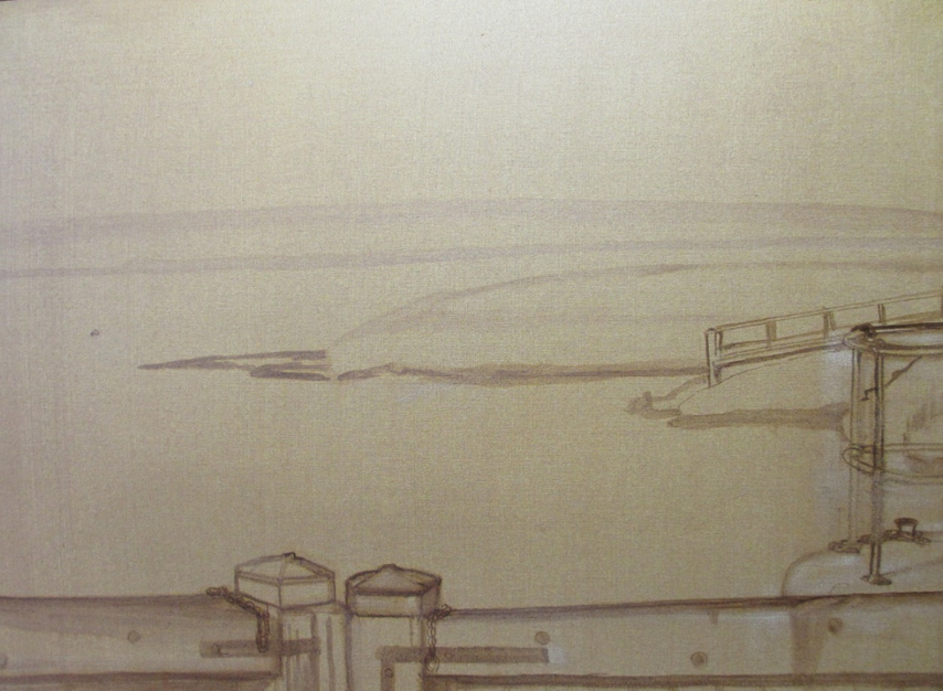
My final painting in this series involved a view of the lock gates. In this work I wanted to emphasise the power and purpose of the gates by cropping the foreground to direct the eye over the vast expanse of the estuary towards the water, which the gates hold back (see below).
 
Preparatory Work
I initially sketched out the drawing for each composition and painted in the tonal areas. I then used the under-drawing as a guide for the finished painting ( see examples below).


Conclusions and relevance to my practice

The academic research into the concept of scale showed that scaling up elements within an image adds power and dynamism to a work. This is true both for man-made and natural objects. The argument was supported by the paintings of artists such as Sheeler, de Chirico and Sutherland.
Space may be used to contextualise the subject and lead the eye across the canvas. Within the picture plane components may be manipulated, such as by distorting size or perspective. Cropping or dynamic lines and shapes can be incorporated and the composition enhanced.

Taking my practice forward, I will continue to use a limited palette. The merits include the mixing of my own colours which results consistency across a body of work and harmony within the individual image.
Similarly, the “unfinished look” adds creativity to my work and a distinctive approach.

I will continue to consolidate these elements across my practice whilst integrating what I have learned about scale.

I can incorporate elements involving dynamic angles and perspective, cropping, and proportion to add impact.


Tuesday, December 17, 2019

Research: Scale

Research: Scale

Introduction
Over the next few months I will continue to explore the concept of scale. My practical work will build on the new ideas and methods I have already discovered through the study of artists such as Charles Sheeler, Mark Rothko and Peter Doig. My aim is to use concepts about scale to enhance my practice and to help consolidate the development of my practice.

I am going to look at two aspects regarding scale. First, scale can affect the way we see a composition and can be manipulated within the picture plane to add power to a work. In my previous post I have already illustrated this point with Sheeler’s painting “Water”, 1945.

Secondly, the size of a painting itself impacts on the experience of the viewer in a number of ways, often contributing to mood and atmosphere. A good example is Rothko’s Seagram Murals at the Tate Modern, already discussed.
My own exploration into those ideas and methods have already begun, and I will shortly be illustrating what I have learned with a series of new oil paintings.

CHANGING THE SCALE
Scale is relative to the other objects in the picture, its surroundings, including people.
Kara Walker, No World, from an Unpeopled Land in Uncharted Waters, 2010, Aquatint

In No World, Kara Walker has used imaginative imagery and the scaling up of a pair of hands emerging from the seabed in a powerful image representing the slave trade. The huge hands hold a slave ship aloft while people ashore are seen in silhouette on the shoreline. A large, huge figure, floats ominously beneath the surface of the water. Are the hands trying to rescue the boat and its passengers? They gently raise the ship and hold it up with the tips of their fingers. As the hands are in silhouette, and distorted in size, they make a big impact. I think that this is an excellent example of the good use of scale to make a powerful statement.
 
 
In another example (above), Giorgio de Chirico (1888-1978) uses architectural imagery drawn to a large scale, with severe angles and arches, to give a sense of mystery and foreboding. De Chirico’s unsettling composition uses scale together with distorted perspective and cropping to create the mood of the work. His work involves a strong narrative and links with Surrealism (which is not part of this discussion). A girl runs along with a hoop, but what is the dark shadow set against the bright yellow of the street which is lurking behind the building?


The same techniques to create power and mood can be employed in a similar way using natural objects.
Green Tree Form, Interior of Woods, 1940 (above) by Graham Sutherland (1903-1980) depicts a solitary, abstracted form of a tree root, which due its scale looms out eerily from its surroundings. Sutherland has cleverly used scale, form and colour to depict this strange apparition, which could be a monster appearing from out of the gloom. The background woods or undergrowth is suggested by murky greens and the vague outline of other vegetation.

Conclusions and relevance to my practice
All of the above images use scale to make powerful imagery with impact. Upscaling within the picture plane itself helps with the understanding of the narrative and mood and enhances the experience of the audience. I will use these ideas to experiment playing with scale with the intention of building these ideas into current and future works.
I have already explored aspects of scale in a series of works by exploiting the use of dynamic lines, angles, perspective and proportions. These paintings, and a discussion of them, which will feature in future entries on my blog.
I have also experimented with the use of larger canvases for my paintings. I have increased the size of my work by using two canvases approximately four times the size of the previous ones to explore the findings of my research.
Preliminary findings show that working in a larger scale enhances form and provides further scope to explore space. Increasing the size of a painting creates greater visual impact.  It also allows the development of ideas and techniques which can exploit the painting medium.
The scope for targeting professional exhibitions will improve. My work will also be better placed for external environments including the on-line presence of my practice.


Thursday, December 12, 2019

Research: Artist, Mark Rothko


Introduction
Rothko was an American painter who did not belong to any particular art movement, but he is generally identified as an abstract expressionist. Abstract expressionism is the term applied to forms of abstract art developed by American painters such as Rothko, Jackson Pollock, and Willem de Kooning in the 1940s and 1950s. It is often characterised by gestural brush-strokes or mark-making, and the impression of spontaneity, such as the “Drip” paintings made by Pollock.
Rothko is probably best known as a pioneer of colour field painting – a movement characterised by simplified compositions of unbroken colour, which produced a flat picture plane.
Works
The Seagram Room, Tate Modern
The Seagram Room at Tate Modern is set aside for the display of a set of large Rothko murals. They are curated in their own room to provide the setting which Rothko himself envisaged.
Rothko saw these huge paintings as objects of contemplation, demanding the viewer’s complete absorption. They evoke feelings of spirituality.

Mark Rothko, Black on Maroon, 1958, Support: 2667 x 3812 mm
The background to the murals is that in the late 1950s, Rothko was commissioned to paint a series of murals for the fashionable Four Seasons restaurant, in the Seagram Building on Park Avenue, New York.


During this project Rothko was influenced by Michelangelo’s Laurentian Library in Florence, which he had recently visited. The Library was dark and claustrophobic and included blind windows which added to a deliberately oppressive atmosphere. The room achieved the feeling that Rothko was seeking. As a result, Rothko created murals which were darker in mood than his previous work, and were predominantly maroon, dark red and black in colour.

Rothko realised that the setting of the restaurant would not be a suitable location for such works and decided to withdraw from the commission. The final murals were subsequently presented as a series to the Tate Gallery for display.

The installation includes all nine of the paintings owned by Tate. They are curated as Rothko intended, in reduced light and in a compact space. The impact of the coloured surfaces slowly emerges, and evokes feelings of meditation:

“Almost everyone who enters the room feels an urge to sit down on the benches in the middle of the space. It's as if the emotional weight of these sombre works instinctively makes you sit, instantly drained by them. Before you even have time to try to compose a rational understanding of them, they have a psychological impact”.


Black on Maroon (above) is a large unframed oil painting on a horizontally orientated rectangular canvas. The base colour of the painting is a deep maroon, overlaid with a large black rectangle, which encloses two narrow, maroon rectangles, suggesting a window. The black paint is a solid block of colour, but the edges are blurred. Different pigments have been used within the maroon and the changing tones gives a sense of depth.

The sombre colour scheme and claustrophobic composition adds to the impact and drama of the work.
Conclusions and relevance to my practice
At the moment I am experimenting in the use of larger canvases. I have already discussed the work of Peter Doig and illustrated how he uses scale to tell narrative and to exploit the sensuous nature of the painting medium.
Rothko brings a different element to the discussion. By sheer size, colour, and composition, Rothko very cleverly creates an atmosphere of spirituality. I felt that it was almost like being inside a church when I visited the Seagram Murals. Although I would not want to work in a "colour field style", I do think that I can gain insight by considering how size, coupled with colour and composition, can add to the mood and atmosphere of a work.


Research: Artist, Peter Doig


Peter Doig b. 1959

Introduction
Peter Doig is Scottish painter and one of the most renowned living figurative painters. In 2007, his painting White Canoe sold at Sotheby's for $11.3 million, then an auction record for a living European artist.
Themes of "magical realism" stream through Peter Doig’s work, capturing timeless moments of perfect tranquillity. Doig works on a large scale.

Art critic Jonathan Jones has said about him: "Amid all the nonsense, impostors, rhetorical bullshit and sheer trash that pass for art in the 21st century, Doig is a jewel of genuine imagination, sincere work and humble creativity...…..

"Stroke of genius: Peter Doig's eerie art whisks the mind to enchanted places",
Jonathan Jones (16 May 2015), The Guardian.

Works


In this example, Doig works on a large scale. The canvas is more than twice the size of my latest “large” painting .
An eerie quality is created here in a woodland setting. The concrete building in the background comes alive with strange floating shapes, shadows and lights which seem to have an organic life of their own. The large scale provides further opportunity to explore possibilities surrounding compositional elements of a painting. 
Doig has cropped the image to exclude ground or sky, so that the view has no physical orientation, which catches the sense of mystery. Feelings of being in and encompassed by the woods are evoked.


Doig applies oil paint in a variety of consistencies, ranging from thin washes which seep into one another to areas of thick impasto. His paintings are about the sensuous materiality of paint as much as the subjects which they portray. His approach is illustrated by the small section of Concrete Cabin (below) where we can see the use of line, wash and texture in distinct areas.
 
(Detail) 

Peter Doig, Concrete Cabin, 1994, Oil on Canvas, 198 x 275cm

Building on a similar theme, this painting by Doig of a modern apartment block invokes a mysterious cosmopolitan scene, where the building is almost obliterated by a tangled wilderness. We are only allowed a glimpse inside, which is strangely uncanny. Doig has again cropped the image to exclude ground or sky, so that the view has no physical orientation, but catches the mood of a fleeting moment.
Again, the work is on a similar large scale, which better  permits the creation of a brooding atmosphere.

https://www.saatchigallery.com/artists/artpages/doig_concrete_cabin.htm

Peter Doig, Echo Lake, 1998 oil on canvas, 230 x 360 cm
Echo Lake is a very large, dark painting of a scene at night, even larger than the previous two examples. It is landscape in format, with a composition based on horizontal bands of colour overlaid with detail representing the shore of a lake. It tells a narrative where a man stands at the lakeshore looking out of the painting towards the viewer. His hands encircle his face and his mouth is an o-shape indicating that he is shouting out into the dark lake. His shout recalls The Scream 1893 one of the best-known paintings by Norwegian artist Edvard Munch (1863-1944).
The bottom half of the painting represents a blurry mirror image of the landscape above the shoreline. This mirrored reflection provides the visual version of an echo. Images reflected in water are common in Doig’s paintings and introduce another dimension to his paintings where images mirror each other as a compositional device, adding interest and mood.
Speaking about his work, Doig has commented:
“People often say that my paintings remind them of particular scenes from films or certain passages from books, but I think it’s a different thing altogether. There is something more primal about painting. In terms of my own paintings, there is something quite basic about them, which inevitably is to do with their materiality. They are totally non-linguistic. There is no textual support to what you are seeing. Often I am trying to create a ‘numbness’. I am trying to create something that is questionable, something that is difficult, if not impossible, to put into words ... I often use heightened colours to create a sense of the experience, or mood or feeling of being there ... I think the paintings always refer back to a reality that we all have experience of ... I am using ... natural phenomena and amplifying them through the materiality of paint and the activity of painting”.
 (Quoted in Scott, pp.15 and 17.)

Kitty Scott, Peter Doig, exhibition catalogue, Morris and Helen Belkin Art Gallery, Vancouver, National Gallery of Canada, Ottawa, Power Plant, Toronto 2001, pp.8-10, 13-14, reproduced (colour) p.29
https://www.tate.org.uk/art/artworks/doig-echo-lake-t07467

Conclusions and relevance to my practice

The scale of his paintings allows Doig the space to employ the wide range of his painting techniques and to more fully express the feelings he describes. I can build on Doig's ideas and use scale both to envelop the viewer within the landscape and to use more expressive arm movements to make bolder, stronger paintings. I can use a bigger canvas to experiment with different mark - making techniques, such as thick impasto, thin washes, texture and line.

Doig's  ideas about reflections are interesting. Many of my paintings and prints include water and reflections. I have not thought about using them as a compositional device and I think that I could give more thought to this concept.

Saturday, December 7, 2019

Research: Artist, Charles Sheeler

Research: Charles Sheeler

Introduction

Charles Sheeler (July 16, 1883 – May 7, 1965) was an American painter and commercial photographer. He is recognized as one of the founders of American modernism, developing a "quasi-photographic" style of painting known as Precisionism and becoming one of the master photographers of the 20th century.

Sheeler created a body of work that explored the balance between abstraction and representation, photography and painting.
Sheeler denied affiliation with either cubism or surrealism, and yet his realization that “a picture could have incorporated in it the structural design implied in abstraction and be presented in a wholly realistic manner” clearly demonstrates the influence of these artistic movements.
 
Works
Painting
 
 
In painting and photography, Sheeler presented his interest in industry’s robust architecture. He viewed American factories and industrial plants as modern-day equivalents to the Gothic cathedrals of Europe. Expressing his belief in machinery’s powerful symbolism, he said, "Industry concerns the greatest numbers—it may be true, as has been said, that our factories are our substitute for religious expression." Here, Sheeler adopted techniques from his photographic practice—cropping, sharply angled views—and applied them to painting, presenting the water plant’s massive system of pipes and buttressed towers as an imposing contemporary monument.

Charles Sheeler, American Landscape, 1930
Although the title American Landscape may evoke a rural scene, Sheeler's subject here is the Ford Motor Company plant on the River Rouge near Detroit, Michigan. In 1927 he had photographed the plant extensively, and he would go on to examine it in works in a number of mediums. While these works experiment with arrangements of hard–edged forms and shifting planes, they also make clear how innovative American industry was during these years, how it was generating a radically new American landscape and experience.

The River Rouge project allowed Sheeler to consider further the relationship between the exactitude of photography and the layered, re-created perceptions of painting or drawing. At the close of the 1920s, Sheeler felt that his artistic goals had coalesced in a painting titled Upper Deck (1929; Fogg Art Museum, Harvard University). Of this work, which he based on his earlier photograph of the German steamship S.S. Majestic (2005.100.155), he wrote,

“I had come to feel that a picture could have incorporated in it the structural design implied in abstraction and be presented in a wholly realistic manner.”


Charles Sheeler, Upper Deck, 1929, oil on cavas
Combining elements of cubism with the simplified forms of the ocean liner’s motors, ventilator stacks, and exhaust fans, Upper Deck is a good example of the American Precisionist movement. This machine age–inspired painting streamlines the heightened realism of Sheeler’s photograph that was its source. In the painting, the artist has stripped away every detail that would situate the scene in the working world, erasing the rivets, workers, steam, even the orientation of a horizon line.
Photography


Charles Sheeler, Criss-Crossed Conveyors, River Rouge Plant, Ford Motor company, 1927, Gelatin silver print/photograph
Sheeler's series of photographs of the Ford plant near Detroit was commissioned by the company through an advertising agency. Widely reproduced in Europe and America in the 1920s, this commanding image of technological utopia became a monument to the power of industrial production in the early modern age.


Charles Sheeler, Doylestown House, The Stove, 1917, gelatin silver print/photograph

This photograph was made at the Bucks County, Pennsylvania, home that Charles Sheeler shared with fellow painter and photographer Morton Schamberg. The spare geometry of the eighteenth-century Doylestown farmhouse proved an irresistible subject for an artist eager to explore with a camera the radical formal ideas that had impressed him in the paintings of Cézanne, Picasso, and Bracque. The photograph is a testament to Sheeler's clarity of vision..

Conclusions and relevance to my practice

Sheeler managed to distill a scene to its very essence. He pared down the lines, used hard edged forms , planes and space to create balanced, harmonious works in different media. He created tension between abstraction and representation and elevated it to an exciting level.

In my own work I can build on his ideas of line, form and space. I can introduce structured  compositional design and use cropping and sharply angled views to accentuate elements of robust, industrial architecture.

The relationship with abstraction is important, especially when working on a large scale. It is impossible and undesirable to paint everything in detail. Therefore to be able to distill a scene into its key components, forms and shapes, adds value to a work.

https://www.moma.org/collection/works/79032


Wednesday, November 13, 2019

Research: Conceptual Art - Cornelia Parker


Research: Conceptual Art - Cornelia Parker
Introduction

Overview and Some Key Works
Cornelia Parker is a well-respected, established contemporary artist, living and working in London. She was shortlisted for the Turner Prize in 1997, has exhibited widely and achieved a number of awards for her work.  She is very individual, and her forte is conceptual art, installations and sculpture. She is a great exponent of materials and processes and themes concerning them are at the root of her work.

The work which made her name was Cold Dark Matter: An Exploded View, 1991. For this piece she had a garden shed blown up by the army and suspended the fragments from the ceiling of the gallery. In the centre a light shines and casts shadows of the wood on the walls of the room, making a dramatic statement. It is as if the explosion has been controlled and suspended in time, before the debris falls to the ground. It is a good example of Parker’s creative process.

 
Cornelia Parker, Cold Dark Matter: An Exploded View, 1991
In The Distance (A Kiss with String Attached) (2003) Parker takes Rodin’s The Kiss and wrapped it in string. In doing so, Parker wanted to add something about the complications of love, feeling that as a romantic idea the original was too simplistic. She was saying that sometimes things that bind people together can at the same time suffocate them. Parker was also referring to the artist Marcel Duchamp, who, as an act of sabotage, draped a mile of string over a Surrealist exhibition in New York in 1942.


Cornelia Parker, The Distance (A kiss with String Attached), 2003
Another work inspired by art history, is Parker’s Landscape with Gun and Tree (2010), a 9m high shotgun leaning against a tree at Jupiter Artland near Edinburgh, which draws inspiration from Gainsborough’s “Mr and Mrs Andrews” (c.1750). The owners of the sculpture park are friends of Parker’s and they sometimes would go shooting, which ignited the connection in Parker’s mind.
 
Cornelia Parker, Landscape with Gun and Tree (2010)
Adams (2015) interviewed Parker and concluded that if she has a mission it is:
"to close the culture gap between literacy in science and art – not least because it represents our best chance of preserving the planet on which we all live". (p.7)

In the interview, Parker makes clear her own individuality, saying:
"I think just being an artist is a political act. Just doing things that are not mediated by anyone else. I don’t do many commissions because I don’t want to tick anyone else’s boxes". (p.7)
In making her works, Parker is pragmatic about her approach, describing it as scattergun. She never worries whether it is all going to link up and says:

"I don’t care if people don’t make all the same connections as me "(p.4)

This is a view which I find very refreshing.
Conclusions

Parker expresses individual views and leaves the viewer to make up their own minds on the meaning of her works. She follows in the footsteps of a number of innovative conceptual artists such as Marchel Duchamp, and the concept that the idea can be more important than the art itself. In my own practice I have researched and interviewed a number of contemporary artists, including Mandy Payne, who creates individual and thought-provoking work while at the same time, producing works which are not only technically inventive and challenging, but also thought- provoking. This is the aim I pursue – to produce works which reflect my Artist’s Statement to involve the viewer in considering aspects of the natural and man-made environment in a changing and challenging world.
Adams, T. (2015) I don’t want to tick anyone else’s boxes. [Online] The Guardian. 25 January, 2015. Available from:
https://www.theguardian.com/artanddesign/2015/jan/25/cornelia-parker-interview-i-dont-want-to-tick-anyone-elses-boxes-whitworth-retrospective 
Sooke A. (2013) Hay 2013: Artist Cornelia Parker on five works and the pieces that inspired them. Telegraph. [online] available from:
http://www.telegraph.co.uk/culture/art/10077197/Hay-2013-Artist-Cornelia-Parker-on-five-works-and-the-pieces-that-inspired-them.html