Wednesday, May 22, 2019

Practice Review

Practice Review

 
My Studio

Initial Proposed Research Area

In my Presentation at the beginning of my MA course I described my initial proposed research area as follows:

"An exploration into the sense of place relating to people, industry and landscape - case study, South Ferriby and the River Ancholme".

I then spent time researching various relevant artists and writers and expanded my thoughts in a Written Proposal. I decided that my practical work would consist of a series of paintings and prints. This work has been supported since October, 2018 by my Blog:

Maggiesblog34.blogspot.com

As my practical work has progressed I have regularly used my Blog to review my work and update my Practice Statement to take account of  my exploration into concepts through research and experimentation with techniques, materials and processes.

My updated Practice Statement reads as follows:


MAGGIE TAYLOR

PRACTICE STATEMENT:

“I AM INTERESTED IN HOW HUMAN ACTIVITY RELATES TO AND INTERACTS WITH THE NATURAL LANDSCAPE. INDUSTRY, HOUSING AND LEISURE IMPOSE THEMSELVES ONTO THE LANDSCAPE.  NATURAL PHENOMENA IMPACT ON THE LAND AND THE ENVIRONMENT IS UNDER THREAT FROM GLOBAL WARMING. MAN-MADE OBJECTS TAKE THEIR PLACE ALONGSIDE NATURE, PLANTS AND TREES BLEND IN AND NATURE FINDS WAYS OF FIGHTING BACK AND SURVIVING. THINGS LEFT BEHIND GET TAKEN OVER, GRASSES TAKE ROOT IN PAVEMENTS, BUDDLEIA SPRING FROM CREVICES AND BRAMBLES ARCH OVER FENCES. THESE CONCEPTS AND PROCESSES INFORM MY PRACTICE”.

May, 2019
Key points
Concepts
My ideas have progressed in a number of ways as a result of my continuing reading and other research.
I have expanded my thoughts to take account of the ways that human activity relates to and interacts with the natural landscape. So in effect I am looking at how human activity such as industry, housing and leisure physically impose themselves onto the landscape and relate to it. In my practical work I not only reflect on the visual impact and relationship of such things as industrial buildings, but also on the mood and atmosphere which such "interactions" cause.

This site has also alerted  me to the dangerous threat to the site from natural phenomena and global warming. Great damage was done to the cement works, housing and the marina at the case study site in 2013, by a huge tidal flood and my work explores such phenomena. I have made a number of works which concentrate on the Humber Estuary, River Ancholme, tidal defences, and locks.

Details about my research feature strongly in my Blog, both into key academic reading, such as Schama S. (2004) Memory and Landscape and  into relevant artists such as Michael Raedecker, Andrew Wyeth, George Shaw and Michael Landy.

Techniques and Processes

I have explored and experimented with a number of techniques and processes, both in my printing and painting practice.

Print Making

Techniques I have explored include dry point, etching, aquatint, screen printing, "open bite" etching, "sugar Lift" , chine colle and the mixing of techniques. Examples feature in my Blog and the results analysed.

I have also explored many different materials to work with, including steel, aluminium, Perspex, and zinc. After each set of works I have evaluated the results and learned from them.

Painting

As well as print making, my painting practice has significantly moved forward over recent months.

I have explored acrylic paint and oil paints, different grounds such as canvas boards and stretched canvases and new working methods. I have been greatly inspired by the artists I refer to above. I have developed my use of line, tone and colour in significant ways (see my Blog Posts "Painting (1), (2) and (3). My awareness of composition and negative space has increased and I have been able to create mood and atmosphere, which means that I am now speaking with my own personal voice.

Way Forward

My experiments have led me to discover new ideas and ways of working which I will continue to build on. I have already flagged up particularly successful pieces of work and methods in My Blog and how I can use what I have leaned in the future.

There is much yet to discover at my chosen site and over the coming months I intend to continue my artistic journey along the banks of the Humber Estuary, through the lock gates and into the River Ancholme. I will explore the marina and river banks and make my way  up stream to Horkstow Bridge, a very early suspension bridge which is Grade II* listed. The historical importance of the Ferriby Sluice and Horkstow Bridge confirms the impact of the river to the local economy providing a means of drainage and commerce over many years.

 
My studio - work continues
 
Please see individual entries on my Blog for reference details.


Tuesday, May 21, 2019

Exploring Materials: True Grain

Exploring Materials: True Grain

I have continued to explore different techniques in my print making practice.

Many print makers produce screen prints using photographs, and I produced some early prints of the old jetty at South Ferriby using photography last year. However, I wish to develop my screen printing skills by making more use of  drawing. Drawing by hand produces a much more individual outcome and a variety of results can be achieved using different media. I had heard of artists using a product called "True Grain" for hand drawn screen prints and I decided to explore this product.

Screen Printing using "True Grain".

I looked on the internet and found  a product leaflet on "True Grain" which I studied. It appeared that the transparent paper has an "in built" textured surface. The artist can make marks on the surface of the material with black ink, gouache, acrylic paint, pencil etc. and then the work is processed for screen printing in a similar way to a photograph. I bought a large sheet and cut it into four pieces to experiment with.

Outcome

1. Pencil

 
The above screen print was made using pencil alone to produce the drawing. I was surprised how clear  the image came out. However, there were areas on the print where I had made lighter marks which were not so successful in that they had not printed out so clearly.


2. Mixed Media


For my next experiment I used pencil, pen and ink and charcoal. I made a pencil drawing of the factory in the background as I wanted to create a lighter area for the distance. In the foreground I used a mix of drawing in pen and ink and charcoal - mainly employing charcoal for areas in dark shadow. I was worried that the combination of media would not work in case the different areas clashed with each other. However, the print came out quite clear, with not too much "separation" between the different areas. The whole image held together.

Future Use

I have two of the pieces of True Grain left after these experiments. I intend to explore the potential of this material further as I thought that the above prints were successful, mainly due to the fact that I can achieve a high degree of individuality.

I think that I could build up images further by using mixed media and then add layers of colour to the prints. This process would provide me with the opportunity to explore a range of colours as an extra dimension to the screen making technique.


Exploring Painting (3)

Exploring Painting (3)

Building on from my research into the work of artist Michael Raedecker and others, I have over the last few weeks been exploring my practice through a series of four paintings.

Aim

My previous painting experiments gave me insight into how I would like my painting practice to develop. The key elements which I want to explore further involve the following;

- employing interesting compositions which relate to my theme of natural and man-made landscapes
-  ensuring that my personal voice comes through (not just a mirror image of views, but works which reflect my own ideas and ways of working)
- building up the use of negative space to create an atmosphere of mystery and the use of imagination
- using my research into theory and practice (works of other artists) as a base from which to build on
-  bringing all these elements together to synthesise into works of art from which I can develop further

Practical

I have learned during my previous experiments that I can develop certain ways of working, including the following:

- working on a mid-tone base so that I can balance lighter and darker tones accordingly
- using oil paint instead of acrylic which will give me more flexibility due to its longer drying time
- by adding colour in a more discerning way
- the use of a limited palette to encourage the mixing of colours (instead of straight from the tube)
- use inspiration from my research into other artists to  look at things differently.

Series of Four Oil Studies - Process

I decided to make a series of works in oil paint as a way of providing some consistency into my practice and to concentrate on developing the above points.

I bought four matching canvases of good quality and size (Winsor and Newton). They are landscape in shape and are canvas on board. I felt that board rather than stretched canvas would work well for what I had in mind as it would give a smoother, firmer base.

I selected a limited palette to promote the mixing of my own colours and to provide consistency of results. I used Rembrandt oil colour:

- titanium white
- ultramarine deep
- permanent red medium
- permanent yellow medium
- yellow ochre
- burnt umber
- quinacridone rose.

 I mixed burnt umber with equal parts yellow ochre to produce enough a mid-tone as a ground for the four canvases. It was thinned with artist's quality white spirit.

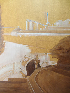
I used a weak solution of burnt umber or white to make line under drawings and then added light and darker tones. I then chose certain elements of the paintings which I wanted to emphasise and developed them using colour.


Line under drawing:


Tonal Under Painting

Outcome

All paintings relate to my case study at South Ferriby

1.
 
 
Hide
 
 
This painting is inspired by the banks of the Humber Estuary. On a turn in the river bank sits a solitary bird hide. I wanted to create an atmosphere of isolation amid the mists swirling around the base of the building where the land meets the water.
 
2.
 
The Lock
 
This work is heavily influenced by the concept of man-made structures holding back the force of water and the workings of the river. Here I am emphasising how such constructions impact not only on the landscape. but also on our lives.

3.
 
 
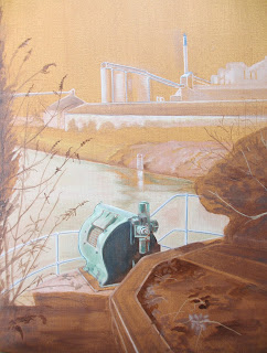
Machine
 
The viewer looks out from behind a machine over the River Ancholme and towards the CEMEX factory. The foreground is in deep shadow, whilst the light glows on the river and factory. Buddleia and other plants have taken hold in the surrounding area.
 
4.
 
 
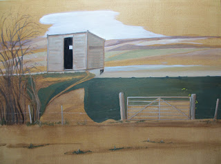
Shed


In a corner of a field sits a shed, derelict, with its corrugated roof being prised apart by a young adjacent tree. Poles are left discarded to its side. Steel structures tower overhead and the factory buildings disappear into the distance. Here I contrast man-made structures with the force of nature and the natural landscape.
 
Analysis
 
Concepts - I think that my choice of subject matter relates well to my ideas about how human activity relates to and interacts with the natural landscape.
 
Processes - The tonal base provided a good ground for the line and tonal under drawing. Oil paint worked well for me as I could manipulate the paint better than acrylic as I went along and the finish is more pleasing to the eye.
 
Colour - The restricted palette meant that I mixed my own colours and achieved more subtle results. I was more selective with my use of colour and as a result I was able to emphasis certain features of each painting.
 
Negative Space - Being aware of, and creating, negative space in my paintings has been a good step forward. It has focused my mind and created room for the viewer to fill in the gaps with their own imagination
 
Atmosphere - All the paintings have an individuality which I was not previously achieving. I think that this is because I stuck strongly to my theme and used consistent working methods.
 
Inspiration - I have built on my reading and research into other artists (See Written Proposal and previous Blog entries). In these most recent works I have been inspired by the work of Michael Raedecker, but also by others such as Andrew Wyeth. I also believe that the work I have put into my print making practice has had a beneficial effect on my painting. The line and tonal under drawing stages relate very much to how I approach an etching using aquatint.
 
Way Forward

 
This series of paintings has inspired me to progress further with my painting practice building on the ideas and techniques outlined above. I will continue to explore and develop those elements which have been successful, drawing on the inspiration provided by contemporary artists such as Michael Raedecker. I will seek to synthesise the best and find my own personal voice along the way.


Saturday, May 18, 2019

Research: Artist Michael Raedecker

Research: Artist Michael Raedecker

Michael Raedecker (b. 1963)


Background

Raedecker was born in Amsterdam, but now works from his studio in Homerton, East London. Raedecker spent a lot of his childhood exploring the Rijksmuseum and the Stedelijk Museum where, amongst others, he admired the work of Andy Warhol. He studied fashion in the Netherlands before completing his studies at Goldsmiths College, London. he was nominated for the Turner Prize in 2000.

His work

Raedecker draws on his background in fashion to mix high art materials such as paint, with craft materials, including embroidery and fabric.

In an interview with Karen Wright of the Independent (Wright K. 2016), Raedecker explains how he keeps things lively and interesting:

"I do like the physicality of it, how involved you are with it. As a painter you are a brush length away, with the stitching you are much closer."

A good example Raedecker's approach and how he introduces stitching into his work is the Getaway, 1997. Here, we can see how he has broken down the composition into the barest colour field esentials and then sketched in the details with delicate stitching, where wool stands in for tree bark and fine silk threads trace the patterns of the trees and ripples in the stream where he sketches in the details.

 
 the getaway, 1997, acrylic and thread on linen, Saatchi Gallery
 
A further example is Raedecker's 1998 painting, overnight (below), where pink and green threads have been stitched into the canvas to represent flowers and grass.
 
 
overnight, 1998
 
The Tate website explains Raedecker's philosophy and ways of working by quoting him directly as follows:
 
Working with thread is something that’s become my technique. Using it is sometimes quite elaborate ... I think of it like building ... memory from the recollection of influences from the past, in the present, maybe even building the future. I think if I had embroidered the whole image then I would go too far, it would really be too much like craft or folk art ... there are certain details which are important so they deserve more work and more detail. Others are empty. There are things happening on the surface of the overall image which hopefully make your eye float around the image ... I always try to find different means for how to use thread ... I don’t fill everything in. I leave room for the viewer to step into the image.
(Quoted in Die Young Stay Pretty [p.42].)

 The Tate also points out that Raedecker specifies that the titles of his paintings should be al lower case letters as for him, a title is "just a word" associated with the image rather than a proper name (quoted in an unpunblished conversation with the artist, 16th October, 2002).
 
Raedecker uses a much reduced and subdued palette of greys, greens and browns with splodges of colour for accentuation, often using embroidery thread or wool for colour detail. A lot of the canvas can be left blank. His subject matter may often be lonely, modern day houses, possibly holiday homes or deserted farm houses. Sometimes isolated flowers and plants appear in the foreground. His architectural images use perspective in an obvious way through his strong use of line, while other forms can be sketchy or even abstract. Some examples are shown below. I have included a number of images as I think that by seeing a collection of his paintings together gives a better impression of the key ingredients of his approach.
 
 
monument, 1998
 
 
occluded, 1997, 1998
 
 
scene, 1997
 
 
shot, 1997
 

perspective, 1998


Raedecker is a big fan of film, and his work is often compared with large American landscapes or spooky settings. He makes good use of shadows to create mystery and  drama, as illustrated in the examples below.


beam, 2000
 

ins and outs, 2000
 
More recently Raedecker has made engaged with different types of images, such as still life and items and views from everyday life, whilst still maintaining  a muted or monochrome palette. Line and negative space still feature strongly in his work. Some further examples are illustrated below:
 
 
destructive superstition, 2004
 

unfold, 2010
 
 
corrupt, 2009
 
trip, 2006
show, 2010

 
species, 2018

Relevance to my Practice

I have been really inspired by the work of Michael Raedecker. I can learn much from him and I am particularly interested in his approach to:

- subject matter (buildings, everyday objects)
- composition
- tone
- line
- negative space
- colour (minimal, but effective use)
- air of mystery, drama

Putting all these elements together gives me direction in where I want to go with my practice. Over the last few weeks I have been building on my research of Raedecker and made a series of four paintings which builds on my previous work and his ideas.


https://frieze.com/article/michael-raedecker

https://www.tate.org.uk/art/artworks/raedecker-overnight-t07515

https://www.saatchigallery.com/artists/artpages/raedecker_the_getaway.htm

Die Young Stay Pretty, exhibition catalogue, Institute of Contemporary Arts, London 1998

https://www.camdenartscentre.org/whats-on/view/line-up

Accessed 16th May, 2019

https://grimmgallery.com/artists/michael-raedecker/

Accessed 18th May, 2019


Thursday, May 9, 2019

Exploring Painting (2)

Exploring Painting (2)

Moving on from my previous two works, I am now focussing on using tonal grounds upon which to work and concentrating on the shapes I see as a basis for my painting.

a) Jetty, Low Tide

I have decided to paint the abandoned jetty from a different angle. This time from the bank of the Old River Ancholme, and looking towards the CEMEX factory site.

I started with a ground of burnt umber, and built up tonal layers using white, yellow ochre, burnt umber and dark brown/black.

I left some of the tonal ground untouched. This process resulted in the creation of a mysterious atmosphere, which I felt suited the subject matter.


Jetty, Low Tide - Tonal Painting
 
Outcome
 
I think that working on a tonal ground really helped with the build up of the image. It meant that I was able to use the burnt umber ground as a reference point for the lighter and darker tones.

It helped me concentrate on the shapes and forms which make up the picture with less distraction from having to think about texture or local colour. The flat plains of tonal colour worked well, especially in evoking the concept of the mud  and shallow water at low tide.

b) Lock Gates, Old River Ancholme

As I walked further along the bank opposite the old jetty, I got a good view of the lock gates which were open at low tide on the Old River Ancholme. I felt that the image provided a good opportunity for a second tonal image due to the interesting view through the lock gates.

Again I used burnt umber as the tonal ground and built up the rest of the image in the same way as above.


Outcome

I felt that the outcome was particularly effective in the way that it focusses on the "key-hole" effect of the view through the open lock gates. The tones worked really well in the way that they lead the eye directly to the brightly lit aperture. The rest of the image is built up with lines and shapes which provide an abstract quality, which is quite arresting.

Future Work

After receiving feedback from my tutor, I decided to leave the two paintings as they are without adding further colour. I believe that they can stand up as works in their own right and have interesting qualities about them with an air of mystery.

I think that these experiments are really taking my practice forward. I am finding out more about how I can use paint in a more effective way to create distinctive  images which build on my themes and provide lots of atmosphere.

I used acrylic paint again for these paintings, but my tutor suggests that in the future I should use oil paints. Oil would give me more flexibility due to the longer drying time and the colours are more natural. I have used oil paint before, and will go back to it for the reasons mentioned and see which medium I prefer.

My tutor also mentioned that my recent paintings remind him of the work of the artist Michael Raedecker. He suggested that I should do some further research into Raedecker's practice to see what I could learn from him. This would be with a view to introducing patches of colour.

Wednesday, May 8, 2019

Exploring Painting (1)

Exploring Painting (1)

Subject matter

My initial two studies have followed my theme of the effect of humans on the landscape.

a) Old Jetty

The first study involves the remains of an old jetty outside the lock gates at the mouth of the River Ancholme where the river meets the Humber Estuary. The jetty has played an important part in the history of the site as it was the place where ships would wait for passengers and cargo and for the lock gates to open. Now it is derelict and abandoned, but it invokes memories of times gone by and the importance of the river to the local economy.

I initially did a quick study as an experiment for a larger, more detailed piece of work (see blog entry for 24th January, 2019). I thought that the first attempt was a good start, but the colours were too soft and pale and the image lacked detail.

 
First study, January, 2019

For my experiment this time I wanted to explore the colours further and the techniques involved in the painting of it.  I had also collected a number of grasses from the site which I had kept in my studio. This meant that I was able to look at the actual grasses which featured in the picture whilst I was painting.

 
Studio with grasses from site
 
I sketched out the outline of the main features in a neutral burnt umber shade of acrylic paint, trying to capture the bleakness of the site and the relationship of it to the rest of the river/estuary and its banks.
 
 
Initial painted sketch


Underpainting
 
I then made an underpainting to establish broad areas of tone and colour.
 
 
Final painting
 

In the final stage I added more colour and detail.
 
Outcome
 
The final painting is much more accomplished than the first study which I did in December/January and I learned a lot during the process. It was very helpful to sketch out the main features first in monochrome. This stage gave me the opportunity to get to know the image in more depth and gave me a guide to follow without having to think yet about colour. It was also a good idea to block out large areas of colour next, as this focused my mind on the key elements and how I wanted the paints to reflect the nature of the landscape from a colour point of view. The preparation enabled me to be more confident to proceed to the final version, having already put in the ground work. I enhanced the colours and added detail. Being able to look at the actual grasses in my studio helped give authenticity to the work. I used acrylic paint which was helpful in that it dries quickly.
 
b) Old River Ancholme
 
One of my first visits to the site was in autumn 2018 when I saw the route of the Old River Ancholme. Looking towards the river I could see the overhead chute taking clay from the nearby quarry to the cement works. The sun shone on the vibrant autumn colours of the plants growing alongside the path of the river. I thought about the contrast of human activity and commerce with the peace and serenity of the river scene. I decided to capture the image in paint.
 
I did an initial first study in January, 2019, but I felt that the colours were too gaudy and the painting too rough and lacking detail.


First study, January, 2019
 
For my next exploration of this scene I wanted to work on the things I learned from my first attempt.  I still wanted to capture the impression of the sun on the autumn foliage but without the sharpness of the colours I had used the first time around. I also aimed to put in more detail, particularly in the foreground where the first study was quite vague. In fact I had not managed to convey the idea of reflections in the shallow water, which I now felt was important to include.
 
To start with I sketched in the key features of the image with a tonal sketch in burnt umber and yellow ochre to give me a guide and to provide the background vibrancy I was looking for.
 
 
Tonal sketch
 
I then added further colour and detail in an underpainting which set out the main elements of the image and background colours for me to build up in the final stages.
 
 
Underpainting
 
As with the jetty scene I looked at the grasses in my studio as I worked which assisted with the shapes and textures of the plants. The underpainting highlighted areas of bright sunshine and parts of the scene which were in dark shade which I was then able to emphasise. I concentrated on the detail of the path of the river as it wound under a huge pipe and the overhead factory chute. I tried to capture the way the light caught the river and the reflections in the foreground.
 
 
Final painting
 
Outcome
 
The second work explores the use of colour in greater depth. I put more thought into the choice of colours and their application. As a result of the tonal and underpainting processes I was able to capture the areas of light and shade better and the outcome has more depth. The foreground is much improved and the reflections are quite successful. I think that the key message I gained from this experiment is to paint what I see and not to try and capture the textures etc. of the image through the way I paint. I still felt that the colours were too bright. I used acrylic paint for this painting as I had done for the painting of the old jetty, and I wondered if it was the right medium.
 
Future work
 
After discussion with my tutor, I think that I now need to build on these experiments by concentrating on the following key areas:
 
- Using a tonal ground as a base for any painting as this provides a good foundation or reference point for lighter and darker areas. This is preferable than working straight onto a white canvas.
 
- Explore how I can paint by looking more at the subject matter and reflecting what I see in painted shapes rather than trying to copy texture.