Friday, October 18, 2019

Exhibition Launch: Mandy Payne "Out of Time", Huddersfield Art Gallery

Exhibition Launch: Mandy Payne "Out of Time", Huddersfield Art Gallery

Introduction

I have previously identified the artist Mandy Payne as an artist who is inspired by urban landscape, Brutalist architecture, social housing and finding beauty in the ordinary/overlooked. Mandy's practice therefore resonates with my own interests. She works with materials which have a physical connection to the sites she depicts, such as concrete and spray paint, building up flat zones of colour:
https://mandypayneart.co.uk/

I recently interviewed her and a record of our discussion features in my Blog of 23rd August, 2019. I will not go over the same ground here, but following our discussions Mandy was kind enough to send me an invitation to the launch of her current Exhibition, "Out of Time" at the Huddersfield Art Gallery. Details of the Exhibition can be found at:
https://www.kirklees.gov.uk/beta/museums-galleries-history/huddersfield-art-exhibitions.aspx

 
Huddersfield Art Gallery

Exhibition Launch, Saturday, 12th October, 2019


Mandy explains her work to visitors

I went along to the Gallery for the launch and was lucky to be able to have another chat with Mandy during which she expanded on her painting and printmaking practice, and in particular, her expertise in stone lithography. She gave me details of a print workshop which specialises in this area.


I chat with Mandy at the Launch as we discuss her prints

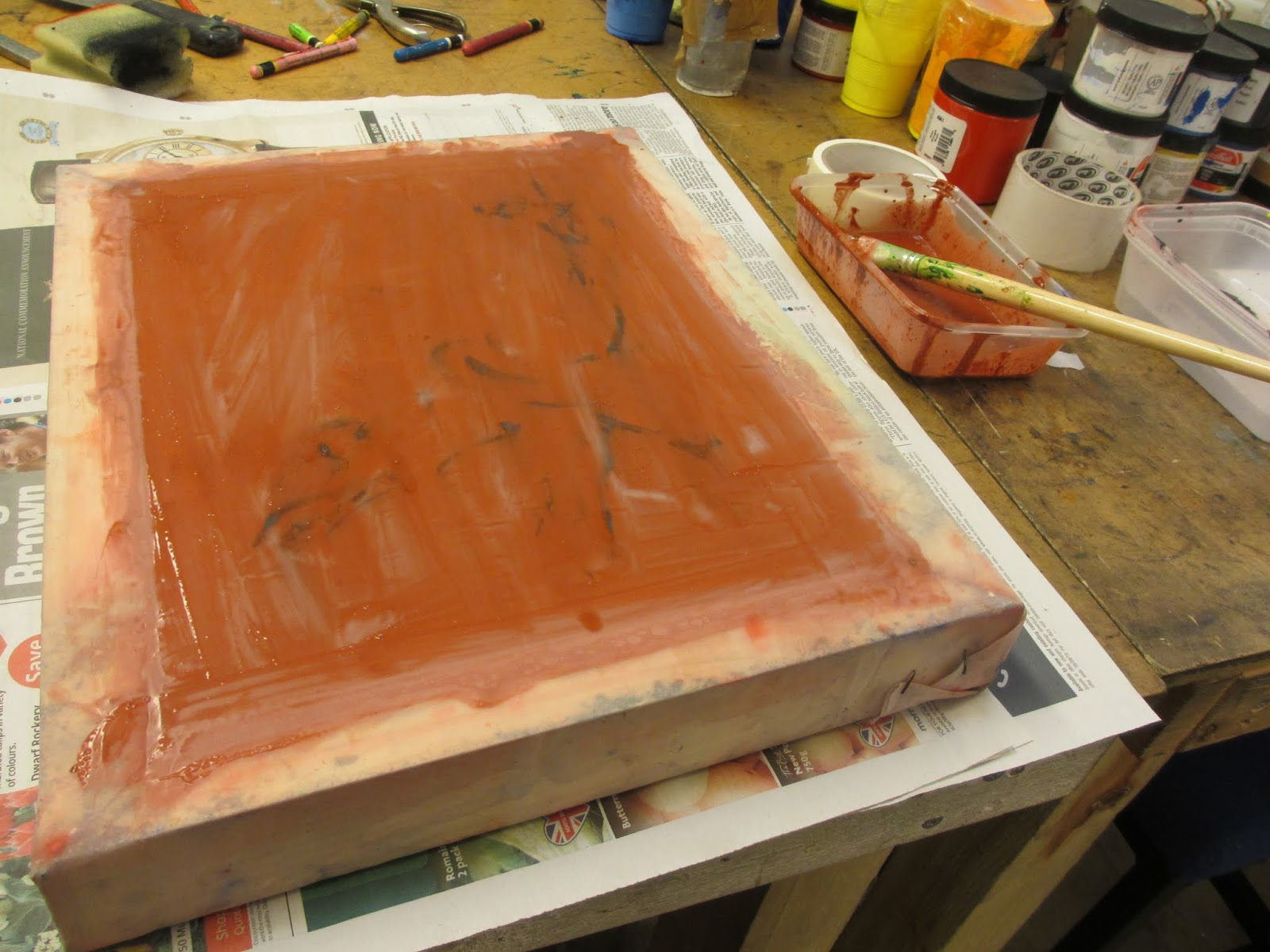
Mandy emphasised how she is inspired by the physicality of the materials she works with.
Mandy has now also introduced marble and fibre glass as well as concrete as a surface for her paintings. She has also introduced additional media, such as marker pen and ink to her work.
I have previously introduced such concepts into my own work. In particular, I have used steel and aluminium as a medium for prints featuring factories and industrial buildings.

 
Buxton House, 2019, spray paint and oil paint on concrete
 
 
St George's Warehouse, 2019, spray paint and oil paint on concrete
 
 
Looking at the Overlooked, 2019, spray paint, oil paint, marker pen, ink and varnish on glass fibre reinforced concrete panel


Out of Time, 2019, spray paint, oil paint, marker pen, ink and varnish on glass fibre reinforced concrete panel
 
 
Remnants of a Welfare State, 2019, spray paint, oil paint, marker pen on glass fibre reinforced concrete panel
 
 
Kirklees College, 2019, spray paint, oil paint, lithograph ink and varnish on canvas
 
 
Glass cabinet of prints and printmaking tools
 
Mandy emphasises her social messaging with the use of pertinent, and sometimes political, overtones.
 
For the Many Not the Few, 2019, spray paint and oil paint on marble
 
Conclusions
 
Seeing Mandy's work emphasised the physicality of her work. Some of her paintings on concrete were set within a wooden frame, whilst others were hung without any frame. I think that the unframed concrete made more of an impact as the materiality of the substance was clearly in view. The gallery was well lit and the paintings hung spaciously. The glass cabinet was a good way of exhibiting the prints, some of which were printed on delicate Japanese paper stuck onto stone and varnished. Viewers were engaged and enthused by the exhibition and Mandy added to the experience with her "hands on" approach and interaction with those present.


Saturday, October 12, 2019

Colour: Exploration - Working with water colour backgrounds to prints

Colour: Exploration - Working with water colour backgrounds to prints

Introduction

Over recent weeks I have been exploring the use of water colour backgrounds for prints. The idea is that this process would add an extra layer to prints to provide colour and depth. During my research I had spoken to other artists who add coloured backgrounds, a good example being Mary Carrick, who works mainly with collagraphs. She often introduces colour by creating a second collagraph which she colours in a variety of ways and prints over the top. I thought that it may be a good idea to experiment with water colour as the paint is transparent and has good potential as the printed line would show through.

Experiments

1. "Hide"

On the banks of the River Humber there is a bird hide which I have used as a subject for an oil painting. The hide stands alone on a turn of the bank heading towards the locks at the Ancholme River. I walked along the bank in the Spring and looked inside. The window looks out over a large stretch of  marshland with the Humber Bridge in the background. I continued my walk and upon my return I noticed the view again. I came up with the idea that I could do a print with three views - approach from the east, approach from the west and the view from inside the hide, looking out towards the Humber Bridge.

I started by preparing a piece of aluminium and drawing into a hard ground to create a line drawing of my idea. I then printed out an initial first impression to see how it could be improved.

 
The initial line drawing

I felt that I then needed, as a second stage, to add tone to create light and dark areas. I achieved this by using an aquatint which I etched in stages and reprinted the image with black ink.

 
Tonal areas added using aquatint process

Thinking about how I could introduce colour, I pre-prepared some printing paper and marked out the exact size of the final print. I then looked at the initial prints and worked with water-colour to follow the three sections of the subject matter. I used a variety of colours, but kept each background within the refines of a limited palette. I then printed the plate onto the pre-prepared coloured backgrounds.


Final Print with green and brown palette
 
 
Final Print with blue, orange and red palette
 
2. "Horkstow Bridge"
 
Horkstow Bridge is about one mile upstream from the locks at the entrance to the Ancholme River. It was designed by Sir John Rennie as part of the River Ancholme Drainage Scheme, completed in 1836, and is a Grade II* listed building. It is a very early example of a suspension bridge. It is a surprisingly magnificent structure for such a remote spot, but the bridge was used in the 19th century as a vital link over the river from a nearby quarry. Horkstow Bridge reminds me of how local people have used the river and its surrounding environment as a source of economic prosperity over many centuries, adapting and changing the environment over time.
 
I decided to follow the same methodology as above to add watercolour backgrounds to some hard ground etchings which I had made. I played around with different colour schemes.
 
 
Watercolour background using "Fauvist" colours
 
 
Finished print
  
 
Watercolour background using a more limited palette
 
 
 The Finished Print
 
I also experimented by painting an etching with watercolour after it had been printed in black. I followed the "Fauvist" theme.
 
 
Watercolour added following printing
 
Conclusions
 
The final prints worked well in that the colours provided depth and colour interest. The colours harmonised well and the limited palette was restful to the eye. The Fauvist colours were more interesting and provided excitement. The method enabled a freely painted background to blend in with the scheme of the design without being a rigid process - the final outcomes had a sense of "flow". This contrasts with the print which was hand coloured with watercolour afterwards, as this process produced more accuracy in following the lines of the image. The fact that the paint was transparent allowed the detail of the line drawing to show through. Both methods were successful in that they gave "life" to the prints and "lifted" them. Hand-colouring afterwards would be more appropriate if detailed, accurate colouring is required.


Thursday, October 3, 2019

Screen Printing: Exploration - Working with Stencils and Drawing Fluid (or other medium).

Screen Printing: Exploration - Working with Stencils and Drawing Fluid (or other medium).

Introduction

Last month I attended  a Workshop on Screen Printing with artist Alison Stack. My aim was to increase my confidence using this medium and to learn new skills and techniques. My previous research has highlighted that screen printing provides the opportunity to produce prints which I can enhance with coloured images and backgrounds. Also, screen printing  provides opportunities to make monoprints i.e. "one-offs" and series of prints using stencils and other methods. This workshop concentrated on the stencil method of screen printing and working with drawing fluid and other mediums.

Materials and Equipment

The workshop was very informative in that the instructor, Alison Stack, provided information and examples of the equipment required, including:

- aluminium screen printing frames, which are better than wooden ones as they do not warp
- white mesh for ordinary purposes, but yellow/orange mesh for photo-printing
- a mesh size of 55T is suitable for general purposes ( a wider mesh is required for fabric and a finer mesh for photo emulsion work)
-  a wooden printing base fitted with butterfly clips/clamps screwed onto the board
- a plastic sheet (acetate) can be attached to keep the board clean (or to do a trial test)
- acrylic "Speedball" inks (for fabrics or otherwise)
- can "refresh" old inks with Glycerin/Glycerol
- acrylic screen filler (for mixing with acrylic inks at the ratio 1/3rd ink to 2/3rds filler)
- i.e."System 3" Acrylic printing medium or "Speedball" screen printing transparent base.
- squeegee of a size which must fit within the screen
- screen filler remover for cleaning (or use plain water)
- screen printing paper no thicker than 300 grm (ordinary printing paper for etching etc. ok)
- smoother paper required for detailed work
- a frame may be purchased to keep the screen firm whilst in use

The screen attached to board with butterfly clips
 
A frame to clamp the screen firm whilst printing
 
 
An example of  a printing medium
 
 
Method

Stencils

- do everything "clean" first
- then do the printing process
- use greaseproof-type paper for the stencil
- trace image onto the paper
- take a craft and cut the image out of the paper
- tape the stencil onto the mesh on the outside of the screen (the flat side)


The drawn image and cut out stencil

 
The stencil attached to the screen

- with this method the image when produced is not "reversed"
- turn screen over and check what you see
- the deep part of the screen is called the "well"
- tape can be used to block off parts of the screen, or the greaseproof paper can be made the exact size of the screen so all parts (except the stencil image )are blocked off
- leave at least 1 inch around the inside of the well for the image - do not let the image go right up to the edge of the screen's frame
- screw clamps down onto the screen
- attach acetate onto wooden base to keep the board clean
- lift screen up and prop up (after every print)
- pour ink out at the top of screen

 
ink applied with screen lifted ready for flooding the screen
 
 
paper placed under the screen
 
 
acetate attached to keep the board clean
 
- flood screen while still propped up - move squeegee backwards and forwards once so that the ink returns to the top of the screen (gets the ink into the mesh)
- put paper underneath and line it up by the eye
- put screen down on paper (flat)
- pass squeegee down the well of the screen at 45% (the "pass" can be once or more than once)
- lift up the screen and take the paper out


        series of prints

 
finished print

- push the ink back up to the top of the screen again with the squeegee
- if run out of ink reflood the screen
- at the end of the process save the ink
- clean up straight away and do not let the screen dry out
- cover the ink with tape or cling film
- clean screen with plain water (better) or a little Fairy Liquid

I used an image of a hoopoe bird for my stencil, as it has a very distinctive silhouette.

Drawing

Using "Speedball" Drawing Fluid/other mediums

- put picture or a stencil underneath the screen (flat side up) to draw from
- draw with "printing medium"
- use a different screen for different colours or can block out the colour done first with screen filler
- let the drawn image dry
- cover the whole of the outside of the screen with screen filler (a blocker) and let dry
- spray with water to remove the drawing fluid
- print as before
- can use "Speedclean" - good with brush and water
- can use soluble painting crayons with screen filler over the top
- can draw with graphite or with water soluble printing crayons (on top/flat surface of screen)


      Application of drawing fluid

 
Detail

 
Exterior covered with screen filler


         Use of soluble painting crayons

Conclusions

The stencil print is clear and the method used was relatively straight forward as set out above. I think that this method could be used in circumstances where I want to create a strong image, perhaps with another print underneath.

The drawing method is more fluid and deserves further experimentation as due to time limits it was not possible to explore all possibilities using this way of working.