Thursday, April 30, 2020

Monoprinting in "Lockdown" (2)

Monoprinting in "Lockdown" (2)


"Docklands", monoprint using acrylic paint

Introduction


I have continued experimenting with monoprints due to the continued "lockdown" situation. I aim to use this period to learn new skills which I can build into my practice.

Monoprinting with acrylic paint (using masks/stencils)

The image is created using a simple image. Dried flowers and leaves etc. may also be incorporated into the process and used as a stencil.

Process

- Find a piece of cardboard to create a window/frame
- Cut out a square 20cm x 20cm (a handy size as A4 paper in half fits this size of window)
- Apply PVA glue around the edge to make water tight window
- Draw out an image in pencil on a piece of paper (the same size)
- Cut out sections of shapes to create masks
- Take a piece of heavy printing paper
- Tape the printing paper onto the back of the prepared frame
- Create a palette of acrylic paints
-Work quickly as acrylics dry quickly
- Create a pad of soft scrim to hold  and apply the paint
- Use the edges of the masks and plants as a marker
- Apply the acrylic paint with the pad and work around the edges, stamping into the surface
- Take away the mask
- Add different colours to the print by using the edges of the other masks as a guide
- Build up image and definition in layers of acrylic
- May add other shapes and objects to enhance the image
- Work colour in between stencils and lift off
- May use as many colours and layers as you want
- Let print dry
- Take tape off the back of the image
- The finished print may be used as a base to paint on top of parts if desired.
 
Sketch
 
 
Sketch cut into shapes and dried leaves added
 
 
Inking process using the masks as guide
 
Monoprinting with Collage
 
 
Final print
 
Process
 
- Use etching ink as more translucent (can use relief ink)
- Choose a simple image
- Make three collages for three different parts of the total image and for three different colours
- Ensure all images are exact copies of the main drawing (use tracing paper)
- If using mountboard can use shellac to seal (not essential)
- Cut out any areas to be white on each collage in exactly the same place using a scalpel
- Stick on some other pieces of paper/card/other materials for the darker areas to be inked
- Over print each collage with each colour separately
- Mark up three sheets of paper with register marks to match up each separate collage
- Roll out the colour for the first image
- Roll ink onto first collage
- Place collage on registration mark
- place paper on top
- Work back of paper with spoon or baren
- Take paper off and set aside (the paper will be re-used to overprint the remaining two collages with two additional colours)
- Repeat the above process using the two remaining collages and colours
 
 
The three prepared collages
 
 
Any left over ink may be used as follows:
- Roll the remaining ink onto dried leaves/shapes/ feather etc.
- Take a piece of paper
- Lay the objects on the paper next to each other
- Place a piece of printing paper on top
- Roll with a dry roller
- simple prints can be produced like this
 
Summary
 
The acrylic monoprinting produced a better result than using the collages.The acrylic paint allowed me to work freely and build up an image as I went along. It was more akin to a painting process. The collage method of monoprinting involved a lot of preparation, which I did not think was reflected in the finished print. A lot of detail was lost. The process was more rigid and the finished print was not well defined. I will try the acrylic paint method again, but perhaps not the collage method, for the reasons given. I may try just creating one collage instead, and see if that produces a better result.


Monoprinting in "Lockdown" (1)

Monoprinting in "Lockdown" (1)


Introduction

Since 23rd March, 2020 the UK has been in "lockdown" due to the pandemic caused by the Corona Virus. The population was ordered to stay at home, protect the NHS and save lives. Our everyday lives came to a grinding halt.

During this period I have been experimenting with monoprinting, due to the fact that such prints can be made without the use of specialist printing equipment such as acids, an aquatint box or a press (which would be found in a printing workshop). This means that monoprinting can be done at home using everyday equipment. Only one print is produced during this process - hence the name "mono".
There are a number of different ways to create a monoprint and I have explored a few of them.

Monoprint with Water Colour

This method involves painting a water colour picture onto a piece of glass or Perspex. A piece of paper is then placed over the top to create the print, as follows:

- use an acrylic sheet or piece of glass
- the surface should be scratched slightly with sand paper to create a "key"
- a light layer of soap or washing up liquid can be smeared across the surface to help lift the icture
- paint a water colour image onto the glass or Perspex
- reverse the image if required
- soak printing paper to re-activate the water colour
- thin paper works best
- it does not matter if the [paint dries
- take the surface water off the paper
- place the damp paper over the water colour painting
- use a roller, spoon or baren and press on the back of the paper evenly
- remove paper to reveal print.

 
Process - Water Colour Monoprint
 
Monoprint using transfer technique
 
 
Monoprint using transfer process
 
- use a plate such as zinc
- use etching/intaglio ink (probably can use relief ink or oil paint)
- Create a thin, even film of ink using a roller on the plate
- mark the plate on a piece of background paper (to register the image)
- place the printing paper on top
- draw with pencil
- can add tone with soft tool or finger
- roll with roller
- lift off
- can them clean the plate, add second colour to cover cleaned plate
- place first image back on top of second colour on plate (register image)
- draw and add tone as before
- roll with roller and lift off
 
 Note: a further image may be obtained by placing a new piece of paper on top of the inked plate and roll with roller or use spoon/baren to obtain surface image left behind on the plate.
 
 
Monoprint transfer process
 
Whilst experiment with this process I discovered that Paul Gaugin had originated the technique. I then researched this element of his work -  which forms a separate entry in this blog.
 
Summary
 
I discovered that using these simple processes it is possible to obtain an interesting and unique image. The monoprints have a specific charm and I intend to work on building some of these processes into my practice. In this way I will be able to make my work more unique.


Tuesday, April 21, 2020

Printmaking: Etching -" Mooring" (with poetry inspiration)

Printmaking: Etching - "Mooring" (with poetry inspiration)

 
"Mooring", etching with aquatint
 
Introduction/Background
 
I attend weekly printmaking workshops at the Ropewalk, Barton upon Humber. Each year there is an annual exhibition of works from the studio with an agreed theme.
 
This year we were given a poem to work from, Pied Beauty by Gerard Manley Hopkins. The brief was to make a print which reflects the sentiments of the poem or part of it.
 
As I am interested in the relationship between human activity, industry and the natural world, I focused on the line:
 
"And all trades, their gear and tackle and trim."
 
Extract from “Pied Beauty”, Gerard Manley Hopkins,  (1877) 
 
I wanted to emphasise how a simple chain can not only have an important function, such as for mooring ships, but also how a day to day object can be a thing of beauty.
 
The Process
 
I thought that the chain required a good drawing to work from as its links were quite involved. I therefore took some time to do an accurate drawing, making sure that the links rested well on the quayside. There was also a rope fastened around the bollard and an old wooden post, which made interesting additional features.
 
 
Pencil drawing
 
I applied a soft ground to a piece of zinc and etched into it using the drawing as a guide. I then etched the zinc in nitric acid to create a linear print.


First proof (linear print)
 
I felt that although the linear drawing had worked quite well, the print needed some tonal qualities to add depth and atmosphere. I therefore applied an aquatint and gradually stopped out the tonal areas in three stages and etched the plate.
 
The outcome
 
 
Final print
 
The print has now got some good depth with the addition of tone, and the print was much improved with the application of the aquatint. The highlights on the metal chain work well and contrast with the softer textures of the wood and ripples of the water. There is also some dappled light shining on the dark wet quayside - which links in with the theme of the poem.
 
It is now in doubt whether the exhibition will go ahead due to the Corona Virus Pandemic, but the idea was well worth while. It gave me both food for thought and another angle to my work.


Saturday, April 18, 2020

Printmaking: Etching - North Bridge, "On the Bridge"

Printmaking: Etching - North Bridge, "On the Bridge"

 
"On the Bridge", etching and aquatint
 
Introduction
 
When I wander around the River Hull area I am struck by how important the bridges are to the proper functioning of the city. They provide access over the river for road and foot traffic and when lifted allow for the safe passage of river craft. Before the bridges existed there were ferries to enable the two sides of the river to function as one entity.
 
I became aware of the engineering involved in the design and construction of a bascule bridge (a type of draw-bridge) when I painted Drypool Bridge. Scherzer was the inventor of a refinement of the bascule bridge called the Scherzer rolling lift bridge, which is the concept used for both of the Drypool and North Bridges. The design pivots the bridge like a rocking horse.
 
In days gone by I have driven and walked over this bridge without really taking in the engineering feat involved. Now, when I am on the bridge, I look up and see its massive structure, the cogs and pulleys and the immensity of the rolling mechanism.
 
I wanted my print to reflect the power and enormity of the human engineering involved and the feeling of enclosure and being within the bridge when crossing it.
 
Process
 
I used a thick piece of zinc to work on. I applied a hard ground as I wanted precision for the linear definitions of the bridge.
 
I used my etching needle to make marks in the ground, going over the thicker lines a few times to make impact. I drew Drypool Bridge in the background, which I etched in the nitric acid for a shorter time to get a fainter line for the distance.
 
I used the composition so that the rolling mechanism became a dominant feature.
 
Once etched, I took a proof print to check it out.
 
 
Proof print after etching
 
I then went on to apply an aquatint and to block out the lighter/darker areas to create tone (see below). The addition of the tone gave greater weight to the apparatus and atmosphere to the image as a whole
 

Friday, April 17, 2020

Painting: Hull Ships Stores

Painting: Hull Ships Stores


Hull Ships Stores (final painting)
Introduction

My next painting is of an old warehouse building on the banks of the River Hull, previously occupied for many years by Hull Ships Stores. It is situated next to North Bridge. The view is from the middle of the bridge as I walked across. Drypool Bridge can be seen in the background.

The old North Bridge replaced a ferry here in 1541, and the remains of the old bridge can still be seen to the left of the building. It was replaced by the current Grade II listed bascule bridge in the early 1930s.

Hull Ships Stores, the ship supplies warehouse, was built in 1870 (architect RG Smith). It is a magnificent example of the grand architecture of the time and reflects the wealth of the shipping industry and associated commerce of Hull during its hey day. The old warehouse is full of character and is a little neglected. The building was converted into apartments in the 1980's and was Grade II listed in 1994.

The image below depicts the busy river scene in 1932 during the construction of the current North Bridge.

 
Hull Ships Stores Building, 1932
 
The Painting Process
 
I started the painting with a quick outline sketch
 
 
Quick outline sketch
 
The next step was to begin painting in the background to add depth. I decided that the river would comprise mainly of negative space to balance the composition and to emphasise the importance of the main building.


Background painted in and negative space added in the form of the river
 
 
Commencement of main building and positioning of windows
 
I then started on the main building. The process was a bit daunting and I feared that I had taken on too much. I initially got the placement of the large central windows in the wrong vertical position. I therefore blocked them out and repositioned them, as you can see in the image above.


I continued working on the structure and architecture of the building. I wanted to capture the large scale of the old warehouse and its character. I widened the depth of the building to better reflect its vast size. I added detail to the windows (42 of them!).
 
 
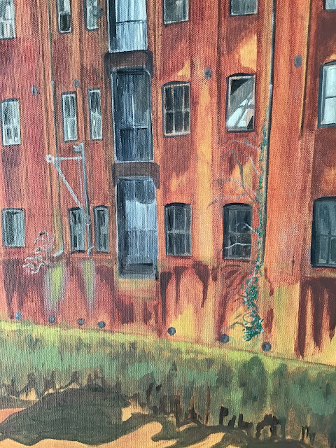
The final stage involved adding the natural growths on the façade of the building, such as buddleia wrapping around the fall pipes and greenery beneath the outflows . There were different varieties and colours of seaweeds clinging to the walls which are revealed at low tide. They formed an interesting feature. I also checked the tones, and darkened the left  and right hand foregrounds whilst also lightening the tone of the river where the light passed through in the background.
 
 
Detail of the façade showing architecture and natural growth of plants on the walls
 
 
Background detail
 
 
Summary
 
I felt that I had taken on a big task. I wanted to do justice to the building and convey references to the past and its faded grandeur. I also aimed to link in the natural landscape of the scene.
 
I set out to achieve this through the scale of the composition and to add to the atmosphere with the use of colour. I used the limited palette which I have used before. The background colour (a mix of burnt umber and yellow ochre) seemed to suit the scene. It blended in with the mud of the river bed and the brick of the building, whilst also adding to the overall atmosphere. I wanted to use the negative space of the river in a constructive way and therefore I chose not to add detail. In this way I emphasised the importance of the old warehouse to the view. The industrial heritage of the building is offset by the natural landscape and plant life growing on the walls reflects the continual ebb and flow of the tidal river. I think that the painting is successful in reflecting the concept of man-made objects taking their place alongside nature in the industrial landscape.
 
My main influences were  Michael Raedecker for the composition and use of negative space, Charles Sheeler for the industrial landscape and Peter Doig for the soft edges and natural landscape.
 

Friday, April 3, 2020

Painting: Scott Street Bridge

Painting: Scott Street Bridge

 
Scott Street Bridge (finished painting)
Introduction

In my last post I explained how I was working on three large canvases. After sketching them all out I decided to concentrate on Scott Street Bridge. I was finding that painting three works simultaneously was very off-putting. I have decided that my way of working lends itself better to really concentrating on one at a time. This way I can really get to grips with the subject matter and become immersed in it.

The painting

Stage 1

My initial sketch was a very rough outline of the structure of the bridge. At this point all I was wanting to achieve was to get the positioning and dimensions right. I could then build up the picture from there.


Stage 2

I concentrated on the background buildings and the middle distance. I wanted to ensure that the scale of the objects behind the open leaves of the bridge helped to enhance the dominance of the bridge over the river and surrounding landscape. I was keen to do justice to its function as a feat of engineering and the magnificence of this Grade II listed structure -  which is about to be removed from the scene and disappear forever.


Stage 3

The next stage was to outline the detail of the structure, such as the railings and underneath mechanisms. This was tricky as it involved not only correctly replicating the structure, but also conveying the character of the bridge and the atmosphere the scene impressed upon me.  I wanted to convey my own sentiments to the viewer. The bridge had a sort of red glow in the soft winter sunlight. I also had to decide on the negative space and paint in the reflections on the water. I altered the foreground to better inform the side angle of the left leaf of the bridge.


Final Version

I added to the negative space and reflections to provide a better focal point leading through the open bridge. I sharpened up a number of tonal qualities and added the buddleia sprouting from the crevices on the left side.

 
Final version
 
Summary and conclusions
 
The main lesson I learned from this painting was the importance of good use of negative space. Once I added to the light on the river at the final stage the whole painting came alive. It gave the image dynamism and strengthened the focal point. I also learned the skill of perseverance, because I found this painting very difficult and had to really stick at it. I think that the work of Charles Sheeler had a large influenced on me during the creative process.