Sunday, January 31, 2021

Printmaking: "Pochoir" Technique

 Printmaking: "Pochoir" Technique


Hoopoe Fantasy, screen print with pochoir technique

I had watched a demonstration on Zoom of the "pochoir" technique by Tim Needham, tutor at the Ropewalk Printmakers. The technique involves using stencils, through which one can add colour and shapes using acrylic paint. Tim made a very good image of a pigeon.

I was inspired to think what I could do, and I looked through some of my old prints. A while ago, I went to a workshop on screen printing, using stencils, and had produced a number of images based on the hoopoe bird, which has a very distinctive silhouette with colourful feathers.


Original Screen print

I thought that to add colour using the pochoir method would add life to the image. I chose certain areas of the bird to add shape and colour to emphasise its attributes, but really it was a fantasy bird.

Outcome

I think that the pochoir method gives a very bold outline, which is excellent for certain subjects, such as the strong shape of the bird. Bright patches of colour add to the image. I would certainly consider using this method again where I want to emphasise shape and colour.


Printmaking: Etching, hand coloured with soft Pastel

 Printmaking: Etching, hand coloured with soft Pastel Etching 


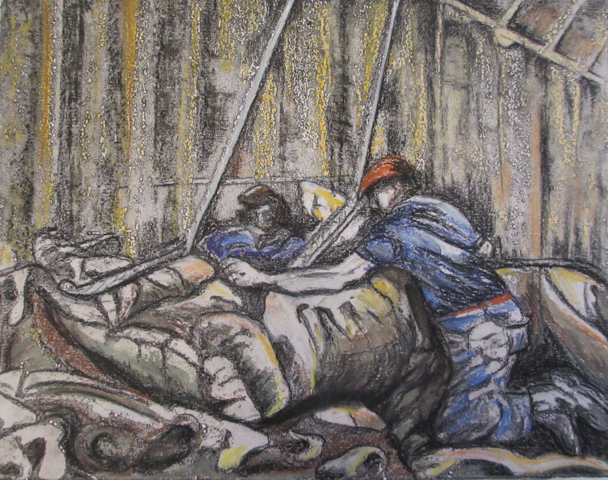
"The Old Ways", etching and aquatint with soft pastel

M.V. "Irene" loading 10,000 tons of sugar for Algeria. Queen Elizabeth Dock, Hull, September, 1972. Photographer - unknown.

I was inspired to make an etching using a photograph of men loading sugar, taken in 1972.

I liked the shapes of the sacks, the taught ropes and the struggle of the men as they man-handled the load. The light was interesting as the men worked in the murky darkness

I etched the print on aluminium and it created a pitted surface. Thinking about frottage, I thought that if I added soft pastel I could use the surface texture to add atmosphere.

I chose yellows and oranges for the areas where the light was seeping through, emphasised the dark tones around the sacks and added red and blue in the foreground for the detail of the figures.

Outcome

I was disappointed with the etching in its original state as it was very pitted. However, the addition of soft pastel not only added colour, but also texture to the print. In the end the print had a successful outcome, the process used adds to the nostalgia and I feel that the image has a lot of character.


Wednesday, December 2, 2020

Paintings: Lock Gates

Paintings: Lock Gates

LOCK PAINTINGS

1.       Lock Gates, Closed


Lock Gates, Water Surge Lock, oil on canvas, 36”/91”cm x 28”/71cm 

On my theme of working with natural and man-made elements, I decided to experiment further with my theme of water using the inspiration from my sketches, photographs and video recordings.

Process

I started by buying some larger canvases (36”/91cm x 28”/71cm), and continued to work in oils with the following palette:

-          Titanium white

-          Ultramarine deep

-          Burnt umber

-          Yellow ochre

-          Permanent Red medium (not used for this painting)

-          Quinacridone Rose (not used for this painting)

I then painted the canvases in a grey base coat which I mixed from burnt umber, ultramarine deep and titanium white. The colour palette is sympathetic to my continuing theme of mood, memory and narrative, within the context of natural and man-made settings.

I also introduced larger paint brushes (50mm and 38mm standard commercial use). The idea was to maximise the advantage of using a larger canvas to obtain freer arm movements and a wider variety of techniques with the larger brushes to better portray the characteristics of moving water. I had done some earlier experiments and an oil study.

I started straight away with the painting of the water. My idea was to experiment and explore. If the work was a disaster, then it did not matter. If the result worked out, I could then paint in the rest of the image.

Having already done a study of the same scene helped. I propped the study up in front of me to guide my work, and I examined it closely on frequent occasions to remind myself as to what had been successful last time.

The grey base created a mid-tone from which to work from as regarding tone and colour. I painted the deeper/darker areas of the water a shade of black and then over-painted in lighter colours. I introduced yellow ochre to produce lighter, muddier, colours and (mixed with ultramarine) to create greenish tinges in areas where the light caught the water.

I used the larger brushes in different angles, sometimes turning the brush to use it on the narrower side. I made sweeping gestures and shorter, sharper accents to create surges and crescendos of movement. To finish off, I used the brushes with a stabbing action to create the effect of spray. I used the rigger brush to make more delicate swirls of action where the water was coming to rest, before it was whipped up again by the currents. I had learned a lot from my earlier experiments which I put into practice. I did not overwork the painting. I did not linger on this process as I wanted to get the effect of spontaneity to match that of the real water.

I thought that the effect was reasonably successful, and I then proceeded to paint in the rest of the picture.  I maximised the light and dark tones and thought hard about how the painting would all work together. I also created blank areas with the aim of allowing the eye to rest and bring more focus to the churn and spray of the moving elements of the water.

Lastly, I added some pockets of grass which had taken hold in the crevices along the top and side of the lock gates, thus adding to the theme of the link between natural and man-made elements.

  Lock Gates, Open


Lock Gates, Outflow, oil on canvas, 36”/91”cm x 28”/71cm 

I chose to paint another version of the lock gates – this time with them open. The water was flowing outwards, slowing as it made its way out of the locks and almost at standstill in the distance. There are swathes of brown, muddy water and mud banks.

One of the reasons for painting this scene was the opportunity to contrast the movement of water at the lock gates in different circumstances. There were no big splashes, the water moved round in swirling actions within the lock pit and then flowed out gently into the estuary. I put into practice what I had learned from my research into the painting techniques of Michael Andrews and Peter Doig during my paint handling experiments

Process.

Stage 1 involved sketching in the scene with a line drawing in oil paint.

I then made watery dribbles to capture the slow movement of the water. I was more definite with my paint handling towards the mouth of the river as the movement of water was nearly at a standstill at that point. The water “twirled” more inside the lock gates and I moved a large brush around in circling, deliberate movements to reflect the state of the current at that point.

I went on to paint in blocks of colour for the gates themselves and lastly added the detail such as ropes and chains.

I painted the background hill across the estuary in cools blues and greens to suggest distance, and the nearer, grassy banks a summer green.

The blue railings and chains also added colour.

I did not fill in all the gaps on the canvas. This is because I wanted to draw attention to the contrast between the man-made, colossal wooden barriers of the gates and the freedom of the natural landscape and habitat beyond.

In the process, I built on my earlier pencil sketch and previous oil study of the same subject. I took the opportunity of working on a much larger canvas to play with the paint. I used a wider range of techniques, distinguishing between three different areas of the scene. The foreground uses bolder movements, the middle capitalises on loose paint handling and dribbles, and for the mouth of the river I used my brushes more smoothly.

Overview and Outcome

The vertical angles of the lock gates and high viewpoint enhanced the compositions and gave a "real life" perspective to the views.

I used subtle colours, almost monochrome in the main for both paintings, but in the second, I accentuated the grassy banks in the middle distance for accentuation, to tell the story and add impact.

The paint handling went well and I used different techniques in each painting to achieve the different water effects. The painting of the water was looser and freer, which suited the dynamics of the subject matter.

Feedback from viewers has been good and encouraging. I received a number of comments about the detailed painting of the water and that it was effective.




Sunday, November 22, 2020

Research: Michael Andrews (1928 - 1995)

Michael Andrews (1928–1995)

Michael Andrews was a British painter, who Tate Britain describes as being,

“rightly regarded as one of Britain's leading post-war painters ……… Andrews's work was characterised by intensity of observation and exacting technical virtuosity. (Moorhouse and Tufnell, Tate Britain website).

Andrews’ approach is well illustrated by his Thames Series, which led from his fascination with the changing moods of the river. His acute observation is reflected in his use of subdued colour and loose, but focused paint handling.

The Thames at Low Tide (below) was partly painted on the floor, and consists of tides of turps and deposits of sediment on the surface, which represents both a literal and illusionistic representation.


Michael Andrews, The Thames at Low Tide, 1994 

In Andrews’ The Estuary different areas have different degrees of finish, thick treacly threads of textured paint meander across the surface, whilst other areas disclose evidence of drawing and underpainting. The muddy brown banks disappear of into the blues and yellows of the open sea, echoing the movement of mud and water.

Michael Andrews, The Estuary (Mouth of the Thames), 1994

Andrews’ work was not only observational, but as he commented, “I am interested in external appearances for what they reveal of what is internal” (quoted in the Tate Britain website).

Tate Britain goes on to suggest that, ”For Andrews, the river suggested both the course of life and the flow of history” (Tate Britain website). So, Andrews’ work resonates with me, not just for his use of paint and colour, but also for the concepts behind his practice.

I start my paintings by covering the canvas with a grey base coat which I mix from burnt umber, ultramarine deep and titanium white. The grey base not only creates a mid-tone from which to work from, but also provides consistency for the atmospheric look I am seeking, recalling memories and old black and white photographs. I mix the colours I consider most appropriate for the narrative or mood of the work. These are mainly cool soft browns, greens and yellows for the natural features of the Humber region. In my colour choices I have been influenced by Andrews, reflected in the Thames Series, above.

My paint handling and use of subtle colour is illustrated in the detail of Lock Gates, Water Surge, shown below.


Lock Gates, Water Surge (colour detail), oil on canvas


Research: Richard Diebenkorn (1922 - 1993)

Richard Diebenkorn (1922 – 1993)

Diebenkorn used geometric shapes and colour to express the West Coast of the USA. A major exhibition of Diebenkorn’s paintings was held at the Royal Academy in 2015. Diebenkorn’s Ocean Park Series of the late 1960s are considered to be among the most important in recent art history, and have been described by the Boston Globe as “some of the most beautiful works of art created in America or anywhere else since the second World War” (quoted in the Royal Academy website).

The Royal Academy considers that, “A sense of the light and space of the West Coast infuse his paintings, revealing a great sensitivity to the environment in which they were created” (Royal Academy website).

Examples of the light, colour and geometric shapes used by Diebenkorn in his paintings are illustrated below.

Richard Diebenkorn, Seawall, 1957

Richard Diebenkorn Cityscape 1, 1963

I have used some of Diebenkorn’s ideas regarding shapes and abstraction in my own paintings, such as in Canal Study, below.


Canal study, oil on board

My colour palette however, in contrast to that of Diebenkorn, reflects the local landscape and weather patterns of the East Coast of England. I have therefore been more influenced in the use of colour by artists whose palette is more subtle and appropriate to my own ideas and locality. I look at one of those artists in my next post.


Friday, October 30, 2020

Success for my Online Exhibition "Two Rivers"

 Success for my Online Exhibition "Two Rivers"

Man in Black Cap, dry point etching, hand printed

I am really pleased that all the hard work for my Online Exhibition, "Two Rivers" has paid off.  The gallery of works represents two years of joy, printmaking and creating a series of large oil paintings of the waterways and banks of the Humber region. As a result I have not only been awarded an MA in Creative Practice, but also achieved a distinction.

I like to think that my practice stirs up enthusiasm in the viewer for the individual and atmospheric landscape of our area. We are fortunate to be surrounded by a rich sea-going and  industrial heritage on both banks of the Humber. Since Roman times, the area has been an important location for settlements, industry and commerce. Evidence of ancient bridges, locks and industrial architecture lines the navigational routes. The lives people forged are etched in the landscape and it is that connection which I seek to capture.

I continue my journey in printmaking and painting and hope that you will travel with me, looking at my website and blog along the way.

Drypool, January Morning


Saturday, October 24, 2020

Printmaking: Hot Bed Press Print Exchange


Printmaking: Hot Bed Press 20:20 Print Exchange


Hope Beyond the Stars, soft ground etching

Introduction

This year I have again submitted a print for the Hot Bed Press Print Exchange. Printmakers from Print Workshops across the country each create a series of 25 prints on paper measuring 20cm x 20cm. The prints are then exchanged nationally and internationally between workshops and the event culminates in a travelling exhibition.

Series of Prints: Hope Beyond the Stars

I turned to my walks along the River Hull as inspiration. I have already made a large oil painting and monoprint of the former Trinity House Buoy Shed situated on the east bank of the River Hull, near Drypool Bridge.

The Buoy Shed is a Grade II Listed Building due to its architectural importance and relevance to Hull's important maritime history. The central bay has a square relief panel depicting the Trinity House coat of arms of three stars and an anchor supported by dolphins with the motto SPES SUPER SYDERA (Hope Beyond the Stars).


The Trinity House Buoy Shed, River Hull


The Trinity House Coat of Arms, the former Buoy Shed, River Hull

Process

I took a square piece of zinc which I thought would be sympathetic to the 20cm x 20cm dimensions of the paper requirements for the 20:20 Print Exchange.

I then applied a soft ground and selected a portion of the Coat of Arms for the image. I drew into the soft ground and created lines and areas of tone. I etched the plate in nitric acid to give a relatively deep etch.

My first proof showed that the process had been successful. I went on to produce a series of 25 prints, taking care to ensure that each print was carefully registered on the paper and wiped in the same way to produce consistency across the edition.

Outcome

The prints are of a consistent quality and the process was a good exercise in the discipline of producing an edition. I hope that the recipients will be pleased with the print and that the prints may even result in some interest across the country and beyond in Hull's maritime and architectural heritage.

 https://www.hotbedpress.org/

https://www.hotbedpress.org/exhibitions/2020-print-exchange/

https://historicengland.org.uk/listing/the-list/list-entry/1197668