Paintings: Lock Gates
LOCK PAINTINGS
1.
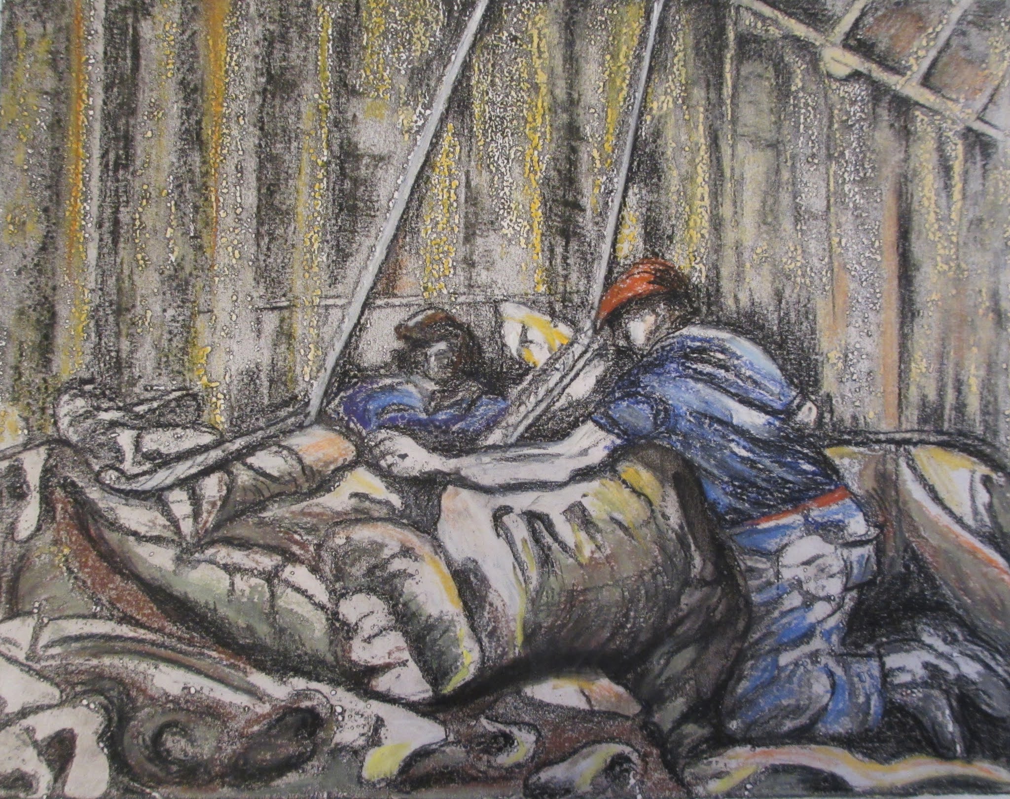
Lock Gates, Closed
Lock Gates, Water Surge Lock, oil
on canvas, 36”/91”cm
x 28”/71cm
On my theme of working with natural and man-made elements, I decided to
experiment further with my theme of water using the inspiration from my sketches, photographs and video
recordings.
Process
I started by buying some larger canvases (36”/91cm x 28”/71cm), and continued to work in oils with the following palette:
-
Titanium white
-
Ultramarine deep
-
Burnt umber
-
Yellow ochre
-
Permanent Red medium (not used for this
painting)
-
Quinacridone Rose (not used for this painting)
I then painted the canvases in a grey base coat which I
mixed from burnt umber, ultramarine deep and titanium white. The colour palette is sympathetic to my continuing theme of mood, memory and narrative, within the context of natural and
man-made settings.
I also introduced larger paint brushes (50mm and 38mm standard
commercial use). The idea was to maximise the advantage of using a larger
canvas to obtain freer arm movements and a wider variety of techniques with the
larger brushes to better portray the characteristics of moving water. I had
done some earlier experiments and an oil study.
I started straight away with the painting of the water. My
idea was to experiment and explore. If the work was a disaster, then it did not
matter. If the result worked out, I could then paint in the rest of the image.
Having already done a study of the same scene helped. I
propped the study up in front of me to guide my work, and I examined it closely
on frequent occasions to remind myself as to what had been successful last
time.
The grey base created a mid-tone from which to work from as
regarding tone and colour. I painted the deeper/darker areas of the water a
shade of black and then over-painted in lighter colours. I introduced yellow
ochre to produce lighter, muddier, colours and (mixed with ultramarine) to
create greenish tinges in areas where the light caught the water.
I used the larger brushes in different angles, sometimes
turning the brush to use it on the narrower side. I made sweeping gestures and
shorter, sharper accents to create surges and crescendos of movement. To finish
off, I used the brushes with a stabbing action to create the effect of spray. I
used the rigger brush to make more delicate swirls of action where the water
was coming to rest, before it was whipped up again by the currents. I had
learned a lot from my earlier experiments which I put into practice. I did not
overwork the painting. I did not linger on this process as I wanted to get the
effect of spontaneity to match that of the real water.
I thought that the effect was reasonably successful, and I
then proceeded to paint in the rest of the picture. I maximised the light and dark tones and
thought hard about how the painting would all work together. I also created
blank areas with the aim of allowing the eye to rest and bring more focus to
the churn and spray of the moving elements of the water.
Lastly, I added some pockets of grass which had taken hold
in the crevices along the top and side of the lock gates, thus adding to the
theme of the link between natural and man-made elements.
Lock Gates, Open
Lock Gates, Outflow, oil on canvas, 36”/91”cm x 28”/71cm
I chose to paint another version of the lock gates – this
time with them open. The water was flowing outwards, slowing as it made its way
out of the locks and almost at standstill in the distance. There are swathes of
brown, muddy water and mud banks.
One of the reasons for painting this scene was the
opportunity to contrast the movement of water at the lock gates in different
circumstances. There were no big splashes, the water moved round in swirling
actions within the lock pit and then flowed out gently into the estuary. I put into practice what I had learned from my research into the painting techniques of Michael Andrews and Peter Doig during my paint handling experiments
Process.
Stage 1 involved
sketching in the scene with a line drawing in oil paint.
I then made watery dribbles to capture the slow movement of
the water. I was more definite with my paint handling towards the mouth of the
river as the movement of water was nearly at a standstill at that point. The
water “twirled” more inside the lock gates and I moved a large brush around in
circling, deliberate movements to reflect the state of the current at that
point.
I went on to paint in blocks of colour for the gates
themselves and lastly added the detail such as ropes and chains.
I painted the background hill across the estuary in cools
blues and greens to suggest distance, and the nearer, grassy banks a summer
green.
The blue railings and chains also added colour.
I did not fill in all the gaps on the canvas. This is
because I wanted to draw attention to the contrast between the man-made,
colossal wooden barriers of the gates and the freedom of the natural landscape
and habitat beyond.
In the process, I built on my earlier pencil sketch and
previous oil study of the same subject. I took the opportunity of working on a
much larger canvas to play with the paint. I used a wider range of techniques,
distinguishing between three different areas of the scene. The foreground uses bolder
movements, the middle capitalises on loose paint handling and dribbles, and for
the mouth of the river I used my brushes more smoothly.
Overview and Outcome
The vertical angles of the lock gates and high viewpoint enhanced the compositions and gave a "real life" perspective to the views.
I used subtle colours, almost monochrome in the main for both paintings, but in the second, I accentuated the grassy banks in the middle distance for accentuation, to tell the story and add impact.
The paint handling went well and I used different techniques in each painting to achieve the different water effects. The painting of the water was looser and freer, which suited the dynamics of the subject matter.
Feedback from viewers has been good and encouraging. I received a number of comments about the detailed painting of the water and that it was effective.