Sunday, October 31, 2021

Visit to York Art Gallery - Exhibition “Pictures of the Floating World: Japanese Ukiyo-e Prints”


York Art Gallery: Exhibition “Pictures of the Floating World: Japanese Ukiyo-e Prints”

Overview

“Ukiyo-e translates as “pictures of the floating world” and refers to the transitory nature of life. Works by prominent Ukiyo-e artists, such as Utagawa Hiroshige, highlight the significant impact of Japanese art on the western world during the 18th and 19th century. Interspersed in between the prints are selected paintings from the galleries main collection, the curator seeking out works which have a Japanese influence. The key topics are well explained and  the prints hung in low light to preserve their fragile colours.

Landscape

The current review concentrates on the landscape aspect of the exhibition. The scenes depicted – tea houses, rice fields, harbours, waterfalls, and mountains, conjure up a unique sense of place.

Hiroshige’s  Asakusa Rice-Fields and Torinomachi Festival (below) illustrates the use of strong line both to frame the composition and within the image. It is noticeable that, unlike in western art, no attempt has been made by the artist to replicate the texture of the cat’s fur, or even to add shading to the animal. Mount Fugi features in the background and is treated in a similar way. A small number of bright colours, blue, orange/peach, and green, bring life to the image.


Utagawa Hiroshige(1797-1858) Asakusa Rice-Fields and Torinomachi Festival, from the series ”One Hundred Famous Views of Edo”, Part 4:Winter

1857 Woodblock print


Alfred Aaron Wolmark, Hampstead Old Power Station, 1911-18, oil on canvas

Exploring how Western artists were inspired by Japanese use of line and colour, the gallery displayed Wolmark’s Hampstead Old Power Station (above). Wolmark became influenced by the colour palette and style of the Post-Impressionists, who in turn, had adopted principles from Japanese art. We can see Wolmark’s daring use of blue, green and pink and how he transforms the power station into flattened forms, with little shading or use of perspective.

Utagawa Hiroshige (1797-1858) Kozuke Province: Evening View of Takanawa, from the series “Famous Places in the Eastern Capital” c. 1853 Woodblock print

Horoshige was inspired by the celebrated artist Hokusai, but Hiroshige’s style is more “poetic” and employs subtle colour gradation, as can be seen in Kozuke Province: Evening View of Takanawa (above). Hiroshige’s subjects were not typical of early ukiyo-e, such as kabuki actors and courtesans, and he came to specialise in landscapes. The Eastern Capital (Edo, modern day Tokyo) was one of his favourite sites that he returned to time and again.

In the late 19th century, it became popular for western artists to adopt the subject matter of Japanese art. Prints of Mount Fugi, and other mountains in Japan, were particularly well liked, and artists flocked to the Bay of Naples, drawn by the striking power of Mount Vesuvius. George Frederick Watts’ painting The Bay of Naples bears similarities to landscapes by Hiroshige which depict popular seasonal sights. These include the view across Lake Biwa,  (see Descending Geese at Katata below) and Mount Haruna under Snow (below). Hiroshige specialised in sensitive depictions of mist, rain, snow, and moon light to convey nature and the changing seasons. We see nature’s elements and drama playing out in Watt’s painting.


George Frederick Watts, Bay of Naples, c. 1885-91, oil on canvas


Utagawa Hiroshige(1797-1858) Descending Geese at Katata, from the series “Eight Views of Omi”

1834-35 Woodblock print

Utagawa Hiroshige (1797-1858) Kozuke Province: Mount Haruna under Snow, from the series “Famous Places in the sixty-odd Provinces”

1853 Woodblock print

Conclusions

The exhibition told the story of Japanese Ukiyo-Prints and the history of the period through a collection of prints with diverse subject matter. Although I have focused my review on landscape, there is much for everyone, including Japanese lifestyle, portraits, animals, and birds. The gallery broadened the scope of the exhibition by exploring links with western art, some features of which I have described above. The exhibition was a good introduction into aspects of Japanese composition, colour, tone, and line which will be interesting to explore in my own painting practice. 

NOTES

The visit was a good example of how to exhibit images in low lighting and the effect was very dramatic. The curator made good connections with the work of British artists, which added another dimension to the exhibition. My reflections on the Japanese use of perspective, line, colour and tone made me think about their use in my own practice. I can connect with the way the prints make use of flat surfaces and line. However, I think their use of colour and tone was less helpful. There is little use of tone, and although the palette works for the prints, I think that they are too “stark” for my estuary/river paintings and for my landscape work generally. I find that Wolmark’s Hampstead Old Power Station, for instance, is too pink/blue and the greens of Watt’s Bay of Naples too “garish”. I am aiming for a more subtle palette of soft browns and greens to reflect the local landscape. However, the strong feelings of place which the works engendered, and their compositional elements are very relevant to my practice and my thinking about broadening my horizons.

I think that the most important feature I can build on is the Japanese use of space and flat surfaces. I already leave areas of blank canvas, and this exhibition reinforced the impact empty spaces can have. As I build up my ideas the spaces can be used to fill voids. The viewer can rest and gaze, and introduce their own thoughts into the gaps, or be guided by my ideas, such as a piece of poetry or a video/sound recording which has inspired the work.

Saturday, October 30, 2021

Exhibition at Eastgate Studios, Beverley

 Exhibition at Eastgate Studios, Beverley


Autumn Leaf, leaf print with chine colle and gold leaf


Autumn Shimmer, leaf print with watercolour and silver leaf


The Locks, etching with chine colle


Wild Things, etching with chine colle

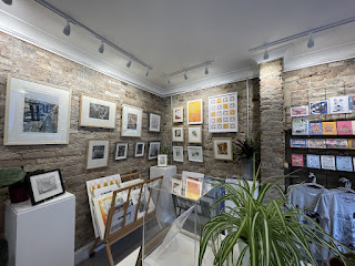
I currently have four prints on display at Eastgate Studios, Beverley as part of the Hull Print Collective Exhibition.

Eastgate Studios

All four prints use different techniques and I experimented using gold and silver leaf in conjunction with the leaf prints.


Exhibition at Caistor Arts and Heritage Centre


Gear and Tackle and Trim, etching with chine colle


Finches’ Wings, monoprint with etching

My two  prints are currently on display at the Exhibition, “Pied Beauty”, by the Ropewalk Printmakers at Caistor Arts and Heritage Centre.
I made the prints in response to the poem, “Pied Beaty” by Gerard Manley Hopkins. 
All the printmakers responded to the wording in their own individual way. In the first print I wanted to capture the way humans interact with natural elements such as ships and the sea. The second print reflects my interest in natural and wild things in the landscape along the Humber. I used two separate techniques. The chine colle was gold tissue paper over printing paper which the image was then printed onto.I painted the Finches’ Wings scene onto a piece of clear Perspex with water colour and made a monoprint. I then inked up my etched printing plate and overprinted the monoprint with the detail.


Wednesday, April 28, 2021

Ferens Art Gallery, 2021 Open Exhibition - Scott Street Bridge

 Ferens Art Gallery, 2021 Open Exhibition - Scott Street Bridge


Scott Street Bridge, oil on canvas, 3feet x 4 feet

I am please to say that Scott Street Bridge has been selected for the Ferens Art Gallery, 2021 Open Exhibition, 24th July - 3rd October 2021.

Please see post published April 3rd, 2020 for more details about the painting.

Scott Street Bridge was the location for the Banksy mural "Draw the Raised Bridge", 2018, when Hull was City of Culture.

The Grade II listed bridge was decommissioned in 1994 and dismantled at the end of 2020, not long after I made my painting. 


Wednesday, April 7, 2021

Painting: The Boatyard

 Painting: The Boatyard

The Boatyard, oil on canvas, 30in x 40in (76cm x 102cm)

Background and Context

The scene I chose for "The Boatyard" is quite ambitious as there is a lot going on. However, I had previously done a small monochrome oil study of the same view which helped me scale it up.

The compositional elements explore the connectivity between the natural environment and human activity through commercial interventions and leisure. On one side of the river is a chalk pit from which chalk is extracted. The chalk is then sent across the waterway by way of an overhead chute which dominates the skyline. Beneath the chute is a boatyard and marina.

Process

My aim was to continue to use empty spaces as a tool to bring the composition together and to let the eye rest. For example, in the top right corner I have a large boathouse which stands starkly on the horizon with a background of dark trees. In front, the brown/grey underpainting of the canvas is left untouched. I use the painted canvas rather like a piece of drawing paper, where line and solid blocks of colour are added as required, but the surface is not fully covered. My inspiration comes from the work of Michael Raedecker, which I have discussed previously.

Inspired by the industrial scenes of Charles Sheeler, the chute and riverside walkway make strong diagonal lines across the painting.  In the middle foreground I have created abstract shapes in the midst of the boatyard.  

In the foreground I have used the opportunity to play with the free handling of paint to depict and represent the qualities of water - techniques which I picked up from studying the working methods of Peter Doig and Michael Andrews. I painted in the dark tonal areas first and then the lighter ones before letting the paint drip and drizzle down the canvas. I oversaw the movement of the paint, and made sure that areas of the canvas I had identified were left bare. These bare patches represent mid tones and create the openness I am looking for. I omitted waterside plants as I felt that they would be too “fussy”.

My inspiration for the use of brighter colours within the boatyard and grassy banks builds on the palette used by Dame Laura Knight and John Singer Sargent. The more muted look of the water in the foreground has more connection with the colours used by Michael Andrews in his “Thames Series” (See previous research).

The oil study I did previously was really helpful in the way that I was able to practice the use of dribbling paint, and I honed in on the technique for the bigger painting.

I built up the painting using layers and it involved three stages. During the first phase I concentrated on the chute and the dramatic skyline. I added the crane and buildings and some shapes to define objects in the boatyard. In stage two I tackled the boat in the foreground and added some further details. A row of vertical wooden poles along the staging provides contrast to the strong horizontal line above. I painted the dribbling water effects last.

Outcome

The painting was a challenge in that it is a bold and complex image. I had to undertake some simplification and use my judgment as to what to leave out. Having already made the oil study helped with this task. The painting gave me the opportunity to experiment with dramatic compositional elements, such as the strong diagonal line of the overhead chute. I also was able to play with the physical qualities of the paint and the use of the canvas surface. The large expanse of river in the foreground enabled me to develop my loose application of paint using drips and drizzles. My experience with using a brighter palette worked well for the sky and middle distance. At the same time, I used strong tonal differences for the shadows and muted colours for the water. I set out to create a realistic interpretation of the scene, offset by areas of negative space and abstract shapes, leaving something indefinite about the work which is difficult to pin down. The edgelands setting is at once serene and turbulent. In summary, the painting contains a certain disjuncture and subtle agitation of elements which I find exciting.  


Saturday, March 20, 2021

Painting; "Lifebuoy"

 Painting; "Lifebuoy"


Lifebuoy, oil on canvas, 30in x 40in (76cm x 102cm)

Background and Context

I am continuing to explore painting on larger canvases and colour, using a brighter palette. During my research, I have looked at the palette used by John Singer Sargent for his landscapes. I found examples of works by Sargent where his use of colour in sun and shade was very relevant to my work. I illustrate “The Black Brook” by way of example (see below). I like the way that the dark depths of the water spring out into the bright sunshine, and the grassy, sunlit bank includes colours which are both soft, but also shimmer in the light. The palette is very “English” (even though Sargent travelled widely and painted many views of Continental Europe).

The “English” factor is important to me as if I get the colours wrong, for example too bright, then I could end up with a Mediterranean feel.


John Singer Sargent, The Black Brook, c. 1908, oil on canvas

Another artist who captures the unique colours of the English coast and countryside is Dame Laura Knight (1877-1970). At an early stage in her career Knight painted startling views of the Cornish Coast, often on the cliff edge with a figure looking out. In The Cornish Coast (below), the light on the figures and rocks is subtly bright and atmospheric, whilst the sky remains cloudy with a lot of grey and intermittent blue. I think that you get this sort of effect very much in England, and I have tried to emulate this result in “Lifebuoy”.


Laura Knight,  The Cornish Coast, National Museum Wales, National Museum Cardiff

As I moved onto a larger canvas, I had to “scale up” the sketch and oil study I had done earlier (see images below). This gave me the opportunity to widen the viewpoint and open up the composition. I set out to capture the vast horizon of the Humber Estuary, and maximise the shadows in the foreground.

        Sketch for “Lifebuoy” painting

       Oil Study for “Lifebuoy” painting

Process

I used the same palette as previously. I also followed a similar process of working from dark to light and then adding detail. I painted the water in one session, allowing the paint to drip and drizzle in appropriate places. I added some highlights to the water at the end of the painting process, e.g. at the foot of the bank (see below).


Detail -water dribbling and highlights added

In the distance the north bank of the Humber tails off into infinity, and this aspect is a crucial part of the composition. The suggestion of an horizon is enough to evoke the scale and vastness of the view.  


Detail – suggestion of the horizon in the distance

The strong sunlight created interesting shadows in the foreground. I had evoked these in the sketch and study. When I came to paint the view on a much larger scale the shadows took on greater importance. I therefore used my artistic judgment to add some tree shadows and elongate the shadows inwards from the grasses on the side of the bank. The image below shows the painting before I added the “extra” shadows. I had been on a walk along the bank of the Humber that day (different location) and noticed the tree shadows en route, which gave me the idea. I think that the additional tonal elements and shapes provided by the shadows adds to the composition and provides more foreground interest.


   Before the addition of tree and grassy shadows in the foreground


Lifebuoy, final painting

Outcome

The large canvas gave me the opportunity to widen the viewpoint and explore the use of a vast horizon, as in some of the works of Anselm Kiefer. I continued to experiment with a warmer and livelier palette, and as a result I was able to portray the bright colours of the spring grass and deep shadows as I remembered them. Looking at the colours used by Singer Sargent and Laura Knight helped me to focus on expressing the “Englishness” of the view and the subtle light in the sky and water. I used the painting techniques of dribbling for the loose expressions of water, which I had discovered during my research into Peter Doig and Michael Andrews.


Thursday, March 4, 2021

Painting: Footbridge, River Hull


Painting: Footbridge, River Hull


Footbridge, River Hull 61 x 45 cm

Background and Context

In my third study I wanted to discover how I could interpret the muddy banks of a tidal river. I had been on a couple of walks along the banks of the River Hull in the centre of the city during last year, and taken photographs.

I remembered how in one place there were bright green patches and lumps of grass growing in the brown clay along the river’s edge. Tall old warehouse lined the route and cast deep shadows, whilst through the gaps the sun shone brightly through. In front of me was a modern footbridge which gave scope to depict a solid structure and work with its strong form. In the distance, there was the distinctive shape of Hull’s tidal barrier and scaffolding to the right. Bollards in the foreground added to the composition and created a feeling of depth and perspective.

Process

I used the same palette and method of working as before. As I wanted a more muted image I left the background sky and much of the foreground void of paint apart from the grey/brown base coat. Where the muddy river flowed through and under the footbridge, I left some of the paint free to drip and dribble.


Dark and light tones (prior to the addition of detail)


Detail (above)

Outcome

I feel that my earlier experiments with paint handling, particularly the two large lock paintings, have helped me use different techniques for the effects I am wanting to achieve, for instance, the watery, muddy flow of the river, and the built-up mass of brown clay left by the receding tide.

CONCLUSIONS

The three colour studies have enabled me to consider the use of colour in different locations and with differing light sources – through a dark “keyhole”, with bright light and reflections, and with side light filtering through gaps in buildings. I depicted a pond, a canal and a tidal river – thus expanding the scope of my practice.

I used colours which I considered would produce an “English” palette, such as that used by Michael Andrews for his Thames Series. My use of colour was also informed by research I did, particularly drawing on the work of John Singer Sergeant.

The change of environment i.e. a river, as opposed to a canal, has given me the opportunity to experiment with the changing dynamic of tidal flow. I can build on this experience as I move forward and expand my practice to portray waterways in the bigger context of the Humber Estuary and large canvases.

Thursday, February 4, 2021

Painting: "Canal"

 Painting: "Canal"


Canal, oil on canvas, 61cm x 45cm

Background

Continuing my exploration of colour, I decided to follow on from "The Gate" with a painting where I could explore lush greens in a waterside setting during early summer.

On the same walk as before, I continued until I reached the canal. I am fascinated by the stark "Brutalist" architecture of the typical bridges we see every day crossing canals across the country, and how they blend in with the natural surrounding landscape. They form a fascinating feature which adds structure to a landscape painting. Interesting shapes and shadows are formed and reflections in the water beneath. In this image, the sloping concrete sides of the canal bridge and the two fences which run alongside not only create a focal point, but their reflections in the water below are memorising. The light struck the fencing in the right hand corner, making it shine brightly in the water beneath, whilst the fence in the shade shows up dark against the slowly moving pool of canal water. The early summer bright greens were also caught by the sun's rays and I contrasted this effect with the darker tones of the greens in the shade.

I used the same palette as for "The Gate", and a similar process. I started out by blocking in the dark colours, blocked in the lighter ones and then went back over the whole painting gradually adding detail. Drips and blank parts of the canvas were included as before to help attain a watery effect and to help let the eye rest and wander.


Dark tones added


Light tones added

Outcome

This colour study really made me think about the different types of greens in early summer and how the seasons affect colour. I wanted to convey the feeling of how spring passes into summer. It may be that I have over-emphasised the brightness of the greens, but that is how I remember the day. There was a strange stillness around at the time, which I think was an indication of the first lockdown. I hope that I have managed to convey some of that eerie atmosphere and the idea of timelessness while the world stood still. Memory played a big part in the development of this painting, as I have been on this walk many times over the years.


Painting: "The Gate"

 Painting:  "The Gate"


The Gate, oil on canvas, 61cm x 45cm

Background and Context

I am continuing to explore the use of colour in my paintings. I have already done a number of tonal studies in monochrome on the subject of water and canals and I am now using that work as a foundation to build on. The concentration on light and dark areas focused attention on tone which I can now transcribe into how I want a particular work to look and feel. Colour (or lack of it) is a great indicator of mood and atmosphere.

At the beginning of the first Lockdown last year, I went for a number of local walks from my home. My destination was the Market Weighton Canal, but as I walked along the path to get there, I passed the local ponds. The path was narrow and overhung with trees. Being early summer and a sunny, hot day, the light was very bright. As I glanced to the right there was a gap in the tree-lined route with a gate and fence, which cordoned off the pond from the track. Through the darkness, there was a gap, through which I could see the glistening surface of the pond and the view beyond. I was excited by what I saw because of the strong silhouette of the the gate and tree to the right. Fallen leaves from the autumn shone bright orange on the water's edge. I took a photograph to remind me of the moment.

I chose this view as an exercise in the use of colour due to the dramatic contrast in colour between the foreground and middle ground/background. Dappled light filtered through onto the undergrowth and across some shallow steps to the gate. I could remember the scene quite well. 

Process

I worked on a soft grey/brown background which I had mixed from ultramarine, burnt umber and titanium white. I included these colours in my palette, together with yellow ochre, permanent yellow medium, permanent red medium and quinacridone rose - a small number of colours to work from and mix as required.  

I started with the light areas, such as the sky and pond and the bright pockets of colour. I then overpainted with the shapes of the silhouettes, mixing dark shades of brown and greens. I let the wet paint dribble down in parts to recreate the look and feel of water, and to loosen up the picture. I left areas of the canvas blank to let the painting breathe.


The Gate, detail

Outcome

The exercise gave me the opportunity to work with contrasting/complimentary colours. I think that the contrast of the bright orange and dark green works well. The dark shapes in the foreground stand out against the lighter shades of the pond and sky, which have a slight orange touch to them. I have not managed to capture the effect of the trees to the left. They displayed soft, yellow new leaves, but I wonder if I should have added more shape and colour over the tree branches. I decided to leave the painting as it was however, as I felt I could lose some of what I had already achieved. On the whole, I think that the painting works well and was good practice for the use of colour. 

Sunday, January 31, 2021

Printmaking: "Pochoir" Technique

 Printmaking: "Pochoir" Technique


Hoopoe Fantasy, screen print with pochoir technique

I had watched a demonstration on Zoom of the "pochoir" technique by Tim Needham, tutor at the Ropewalk Printmakers. The technique involves using stencils, through which one can add colour and shapes using acrylic paint. Tim made a very good image of a pigeon.

I was inspired to think what I could do, and I looked through some of my old prints. A while ago, I went to a workshop on screen printing, using stencils, and had produced a number of images based on the hoopoe bird, which has a very distinctive silhouette with colourful feathers.


Original Screen print

I thought that to add colour using the pochoir method would add life to the image. I chose certain areas of the bird to add shape and colour to emphasise its attributes, but really it was a fantasy bird.

Outcome

I think that the pochoir method gives a very bold outline, which is excellent for certain subjects, such as the strong shape of the bird. Bright patches of colour add to the image. I would certainly consider using this method again where I want to emphasise shape and colour.


Printmaking: Etching, hand coloured with soft Pastel

 Printmaking: Etching, hand coloured with soft Pastel Etching 


"The Old Ways", etching and aquatint with soft pastel

M.V. "Irene" loading 10,000 tons of sugar for Algeria. Queen Elizabeth Dock, Hull, September, 1972. Photographer - unknown.

I was inspired to make an etching using a photograph of men loading sugar, taken in 1972.

I liked the shapes of the sacks, the taught ropes and the struggle of the men as they man-handled the load. The light was interesting as the men worked in the murky darkness

I etched the print on aluminium and it created a pitted surface. Thinking about frottage, I thought that if I added soft pastel I could use the surface texture to add atmosphere.

I chose yellows and oranges for the areas where the light was seeping through, emphasised the dark tones around the sacks and added red and blue in the foreground for the detail of the figures.

Outcome

I was disappointed with the etching in its original state as it was very pitted. However, the addition of soft pastel not only added colour, but also texture to the print. In the end the print had a successful outcome, the process used adds to the nostalgia and I feel that the image has a lot of character.