Wednesday, February 26, 2020

Printmaking: Drypool Bridge (1) and (2)

Printmaking: Drypool Bridge (1) and (2)


Drypool Bridge (1)
 
Etching, nitric acid on zinc with aquatint
 
 
Drypool Bridge (2)
 
Etching, copper sulphate on aluminium with aquatint
 
Introduction

I decided that it would be a good idea to make some prints on the same subject matter as my paintings. Doing so will give me the opportunity to really get to know my subject better. I can look at the compositions from different angles and the printmaking side of my practice will help inform my painting and vice versa.

Drypool Bridge was a good place to start.

Methodology

Drypool Bridge (1)

I took a small piece of zinc and decided to make a print from a similar viewpoint as my painting. This process helped both in getting to know the subject matter better and with the conceptualisation of the painting.

As the structure of the bridge necessitates the use of a lot of straight lines, I used a ruler to guide me. However, the use of the ruler created a number of scratches on the surface of the hard ground medium which then etched into the plate. I learnt from this, either to not use a ruler, to be more careful in the use of a ruler, or to buy a cork-backed ruler, which a fellow artist recommended to me.

In spite of the scratches, the print came out quite well and I can live with the outcome.

Drypool Bridge (2)

This time I used a larger (A4) piece of aluminium to create a similar image, but from a different viewpoint.

I used a soft ground and etched the plate with copper sulphate.

The results were most disappointing. The plate was in the copper sulphate for a very long time, but did not etch well at all. The proof print resulted in just a series of deeply etched dots and the image could scarcely be made out.

To try and rescue something from the print, I then put an aquatint onto the plate and painted stop out varnish where the image was missing and etched it again in stages.

At the inking stage I really had to press hard to get the ink into all of the deeply etched dots (otherwise it resulted in a series of white dots where the ink had failed to penetrate).

Despite the initial failure, the aquatint saved the situation from disaster and the final print has a lot of atmosphere.

Overview

The general idea of making prints of similar themes and images as my painting is a good one. It enables me to really explore and get to know the topic better, sometimes from different view points.

I learnt to be careful with the use of a ruler and how to deal with the situation in the future (cork-backed ruler if use is necessary).

The problem with the etching of the second print and the use of the copper sulphate remains a mystery. I have not encountered this problem before. It was suggested to me that the cause may have been the temperature of the copper sulphate solution (too cold).

The problem has made me hesitant to use aluminium and copper sulphate again in the near future and I will probably concentrate on zinc and nitric acid which is less temperamental.

Painting: Drypool Bridge

Painting: Drypool Bridge


Introduction

Over the previous few weeks I have been working on a large-scale painting of Drypool Bridge at low tide on a dark January morning.

I wanted to continue my experiments with painting on large canvases, which have increased in size to 3 feet by 4 feet.

Working on such a large scale is a challenge conceptually and physically.

Working Methods

I started by covering the canvas with a burnt umber/ yellow ochre wash. I felt that this would form a good base for the cold January morning image.

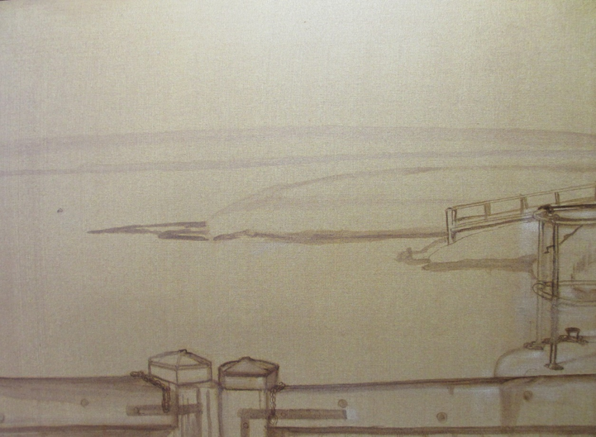
I sketched out an initial first sketch, to place the main features into position.

 
Initial first sketch
 
I felt that it was important to achieve a "layered" effect to gain depth to the picture, and started by blocking in the buildings in the distance so that they could recede.
 

I realised that one of the main challenges would be to correctly interpret the structure of the bridge and its engineering. I researched the background to this type of bridge. A bascule bridge (sometimes referred to as a drawbridge or a lifting bridge) is a moveable bridge with a counterweight that continuously balances a span, or "leaf", throughout its upward swing to provide clearance for boat traffic. It may be single- or double-leafed. Drypool Bridge is a "Scherzer" lifting bridge, which is a type of rolling bascule bridge. The mechanism is clearly visible in my painting.
 
 At my first attempt at sketching the bridge I got the number of "V" shaped elements wrong and had to wipe them out and start again.
 
 
Second stage (bridge structure corrected)
 
 
Third stage (railings and tone added)
 
As the painting progressed I added the railings to the bridge, which gave the composition another dimension. I felt that the railings increased the feeling of recession and layers. I also darkened the tone of the water and added painting medium to help portray the shiny effect of the water in the low morning sun. I aimed to ensure that the shapes on the water surface reflected the nature of the water at low tide and painted some loosely applied drip effects which I let run down the canvas.
 
 At the final stage I added detail to the wooden staging underneath the bridge and some shadows to the grass behind the posts and twigs in the foreground.
 
 
Final painting
 
Detail:
 
 
Bridge structure


Water shapes and drips
 
 
Wintery twigs
 
 
Waterside grass and shadows
 
 
Depth to wooden structures beneath bridge
 
Overview
 
I think that the finished painting has a lot of character and emotion.
 
The colours are subdued and reflect the daylight and time of year. The recession works well with the number of layers created within the composition. The paint handling uses a number of different approaches -  for example, tight control over the engineering structure of the bridge, loosely applied paint for the water, sometimes in drips, and painting medium for the water and to depict the depth to wooden structures.
 
My main influences remains Sheeler (structures), Raedecker (unfinished look and restricted palette) and Doig (for paint handling).
 
I learned a lot from this painting. Next time I will experiment more with negative space as in this instance it was mainly restricted to the sky. Also, I will think carefully about layering to gain depth to any new composition and I will study carefully the abstract shapes of objects to achieve greater definition.


Wednesday, January 8, 2020

New Topic: The River Hull

New Topic: The River Hull

Introduction

Over the previous twelve months I have been studying the site at South Ferriby, getting to know it, and depicting the landscape. In particular, I have considered how the River Ancholme has affected the area's social, economic and environmental features over the years.

I have researched not only the site, but also the work of other artists who inspire me, relate to my practice, and who I can learn from.

My work has culminated in the Portfolio of new paintings and prints, which feature in my recent Blog entries.

However, I feel that I now need to move on and give myself a greater challenge.

New Site: The River Hull

At this point in my practice I am now ready to tackle a different, more varied and challenging environment to depict the interaction between landscape and human activity.
I was born in Hull and when I travel into the City Centre and cross the bridges over the River Hull I am inspired by the views of the tidal river and industry along its banks. Its history goes back decades. The views and moods change with the tides and unpredictability of the weather. The muddy banks at low tide and the disused warehouses and riverside activity are fascinating. The river has captured my imagination.


Bankside, River Hull

Work Panning
Commencing in January 2020, I will sketch views, take photographs and research the area. I will then continue to progress my painting and print making practice in accordance with the approach I have developed so far.
In particular, I will concentrate on capturing the essence of the natural landscape and industrial heritage along the banks of the River Hull, as it travels through the heart of the city and into the Humber Estuary.
I will continue to experiment with larger paintings and with a restricted palette, concentrating on capturing the mood of the riverside landscape.
My prints will be monochrome, but I will experiment with a variety of shades and hues.
The aim of my work will be to capture what this landscape means to me, and in doing so, I hope to touch the feelings of my audience.
Over the next eight to nine months I will aim to produce at least six large scale paintings and a series of at least six prints.
At the end of that period I will hold a public exhibition of my works, at a venue yet to be decided.
Conclusions
I feel inspired by my choice of a new topic. The site links very well with the themes I have developed over the previous year. The natural environment of the River Hull is very diverse and changing all the time. The river has had a huge impact on the way the city has developed. Its location has brought commerce and industry to the area, which unfortunately, more recently, has been allowed to decay. It is said that Hull is a city of two halves - and this is true. Within the city boundaries there are no fewer than thirteen bridges which span the river. When the bridges are raised for river traffic, the city comes to a halt. Ways of crossing the river, using it as a means of travel and a resource, has lead to the development of Hull's unique culture and character. Flooding has been a real threat, and due to climate change, continues to be. Locks, dredging, and the tidal barrier all play their role. Man-made structures dominate the river and the surrounding area, but wildlife, especially in the Humber Estuary, remains very much in evidence.
I have already started to walk alongside the river and begun to breathe in the landscape, its atmosphere and scope for me as an artist..


Monday, January 6, 2020

New Work: Portfolio -Printmaking (2)

New Work: Portfolio -Printmaking (2)
 
COLOUR (continued), and aspects of SCALE
 
Works and process 
 
Screen Printing 
 
 
South Ferriby Marina; “Yacht”, screen print, black 


Experiment: “Yacht” with colour applied during the printing process
 
 Urbscape 1”, screen print, black
 
 
Experiment: “Urbscape 1” with colour applied during the printing process
 
 
A printing screen ready for the inking process
 

Screen printing machine, Hull College
Monochrome
Over the previous few months I have investigated using more colour in my prints as shown in the examples above.
However, although some of the outcomes were relatively successful, I thought that overall the colours detracted from the quality of the prints and their visual impact. The impact was rather "muddled".
Scale within the picture plane
I therefore experimented further by using monochrome. I also used some of the images to experiment with the use of scale within the picture plane. This concept had already been useful in adding power to my paintings, and I felt that the same approach may have similar results for the printmaking side of my practice.
Etchings
 
River Ancholme: “Pylons”, etching, dry point and aquatint, monochrome, in burnt umber (above). The scale of the pylons was emphasised by the use of strong perspective.
I felt that the combination of the monochromatic colour scheme and the dynamic composition was successful. It emphasised the scale of the pylons by the use of a strong perspective angle and the burnt umber added atmosphere.
 
 Old River Ancholme: “Moorings”, etching with aquatint, monochrome, black
Here I used the scale and the height of the landing stage, with its reflection in the water, to add dynamism and mood to the image.

Old River Ancholme, “Moorings”, The zinc plate ready for inking up
Screen printing
 
South Ferriby Marina, screen print, monochrome, black
 
 
The original “Truegrain” drawing (pen and ink with ink wash), prior to being imposed onto the screen
The overhead conveyor belt, which conveys cement across the river to the factory beyond, is very over-bearing on the landscape. I used the scale of the conveyor belt as a powerful tool to emphasise its dominance over an otherwise "idyllic" scene.
Conclusions and relevance to my practice
Colour
As indicated above, I have  concluded that monochrome and the use of a muted palette for prints using a monochromatic colour, such as indigo or burnt umber, is more effective. This approach links better with the concepts of my painting practice, is more consistent, and the works as a whole hold together better visually.
As regards scale, the etching process restricts the size of the metal which can be used, and so the dimensions of my prints will remain approximately the same.
However, there is scope to use composition and the effects of scale to add power and dynamism to a print.
I experimented with this concept during the production of  prints such as “Pylons”, where the scale of the  structures was emphasised by the use of perspective.
I also found ideas behind  the use of scale helpful in constructing compositions around water and reflections, such as "Horkstow Bridge" and "Moorings".
As I move my print making practice forward, I will be concentrating on aspects of scale within a composition, and producing the final prints in a variety of monochromatic colours. My aim will be for this combination to add power to my works and engage the viewer.


This decision has assisted in honing in on the key elements of my practice statement and my approach to colour and a restricted palette.
Scale


New Works: Portfolio - Printmaking (1)

New Works: Portfolio - Printmaking (1)

PRINTS: COLOUR
Introduction
The print making side of my practice continues to be consolidated. I have restricted my output mainly to etchings, which makes the most of my drawing skills and interest in tonal qualities.
However, as well as etchings, I have also made some interesting screen prints, exploring the use of colour.
Works and process
Etchings
Etching Press and one of my prints, Hull College
 
Horkstow Bridge


Experiment: inking up the metal plate direct with different coloured inks, black and raw umber - I rubbed too much of the ink off in parts during the process, and I learned from this.
 
Horkstow Bridge
Experiment: etching printed onto pre-prepared water colour (see below)


Experiment: brighter, more “Fauvist” colours

The pre-prepared water colour under-painting - I tried to follow the composition of the print with colour
 
 Humber Estuary: “Hide” - Initial etching (line - prior to tone being added with the aquatint process)
 
“Hide” etching with aquatint, monochrome, black/brown
 
“Hide”, with water colour under-painting (process as above)
 
I then went on to experiment using colour in the screen printing process.


Sunday, January 5, 2020

New Works: Portfolio - Painting (2)

Creating my own Exhibition (1): Background and Starting Point

Introduction

Over the previous eighteen months I have been developing my practice with a view to producing an exhibition of my work in August this year.

I  built up my knowledge and skills in preparation for creating a successful exhibition in four key areas:

- continuing to compete and exhibit in local and regional galleries as part of large-scale exhibitions

- visiting regional and national exhibitions and galleries

- interviewing practising visual artists and curators

- holding an exhibition/small show of my works at Hull College (May, 2019) and at a Symposium (January, 2020)

This was the starting point for my early ideas, discussions and visits in preparation for the Exhibition.

Participation in Local and Regional Exhibitions

Nunnington Hall
Burton Constable Hall
Hull Fishing Heritage Exhibition
North Lincolnshire Open Exhibition, the Ropewalk, Barton
Ferens Art Gallery
Beverley Art Gallery


What I learned

Visits to Exhibitions and Galleries

What I learned

Interviews and Discussions with Practising Artists and Curators

What I learned

My own Exhibition/Small Show

What I learned

Conclusions and Next Steps

Sunday, December 22, 2019

New Works: Portfolio - Painting (1)

New Works: Portfolio - Painting (1)

Introduction
Building on my research into artists such as Charles Sheeler and Graham Sutherland, my practical work has recently explored the concept of scale.

First, I considered the proposition that scale can affect the way we see a composition and can be manipulated within the picture plane to add power to a work.

I made a series of works exploiting the use of dynamic lines, angles, perspective and proportions, which I illustrate below.
Works


In the painting illustrated above, I explored dynamic angles and cropping as in the works of Charles Sheeler

 
I then went on to play with the concept of perspective, using the dominant hull of the boat and blue tarpaulin as a subject matter. (above)
 
My next piece of research involved introducing large-scale proportions in the foreground. I drew the concrete blocks with the idea that they should command the image. (above)

My final painting in this series involved a view of the lock gates. In this work I wanted to emphasise the power and purpose of the gates by cropping the foreground to direct the eye over the vast expanse of the estuary towards the water, which the gates hold back (see below).
 
Preparatory Work
I initially sketched out the drawing for each composition and painted in the tonal areas. I then used the under-drawing as a guide for the finished painting ( see examples below).


Conclusions and relevance to my practice

The academic research into the concept of scale showed that scaling up elements within an image adds power and dynamism to a work. This is true both for man-made and natural objects. The argument was supported by the paintings of artists such as Sheeler, de Chirico and Sutherland.
Space may be used to contextualise the subject and lead the eye across the canvas. Within the picture plane components may be manipulated, such as by distorting size or perspective. Cropping or dynamic lines and shapes can be incorporated and the composition enhanced.

Taking my practice forward, I will continue to use a limited palette. The merits include the mixing of my own colours which results consistency across a body of work and harmony within the individual image.
Similarly, the “unfinished look” adds creativity to my work and a distinctive approach.

I will continue to consolidate these elements across my practice whilst integrating what I have learned about scale.

I can incorporate elements involving dynamic angles and perspective, cropping, and proportion to add impact.